Shade of the color orange International orange is a color used in the aerospace industry to set objects apart from their surroundings, similar to safety orange, but deeper and with a more reddish…
International orange is a color used in the aerospace industry to set objects apart from their surroundings, similar to safety orange, but deeper and with a more reddish tone.
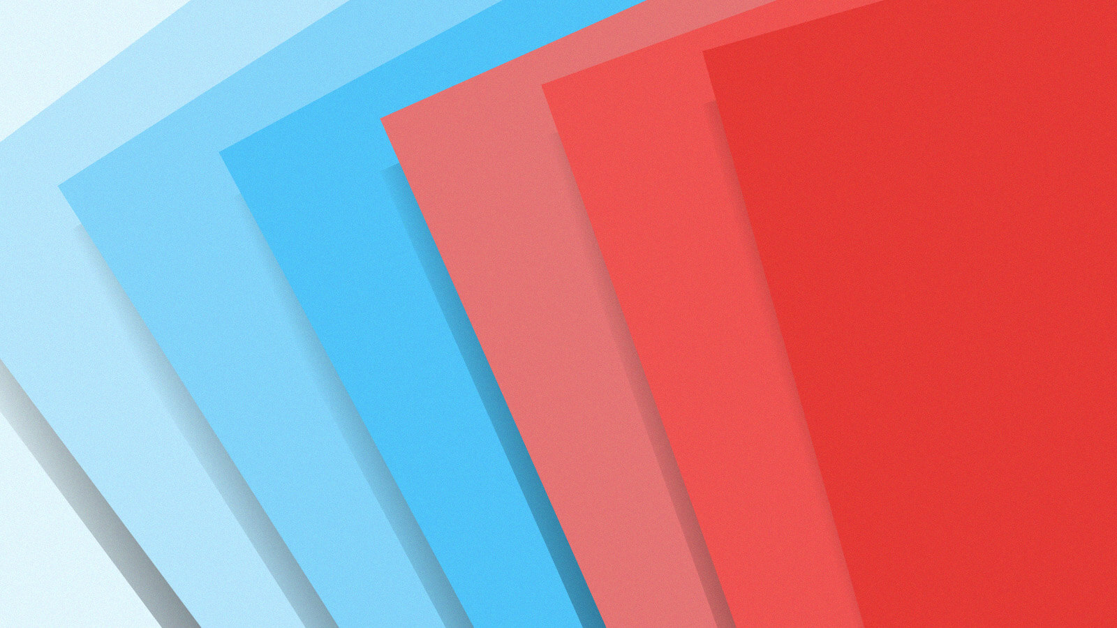
Variations of international orange
There are several variants of international orange.
International Orange
(Engineering)
#BA160C
International Orange
(Golden Gate Bridge)
#F04A00
International Orange
(Aerospace)
#FF4F00
Aerospace
 International Orange
 (Aerospace) Color coordinatesHex triplet#FF4F00sRGBB (r, g, b)(255, 79, 0)HSV (h, s, v)(19°, 100%, 100%)CIELChuv (L, C, h)(59, 152, 18°)Source[Unsourced]ISCC–NBS descriptorVivid reddish orangeB: Normalized to [0–255] (byte)
The Advanced Crew Escape Suits pressure suits worn by NASA astronauts and the previous Launch Entry Suit use this color,[1][2] as opposed to the lighter tone of safety orange used by the United States Air Force's high-altitude suits. This was also planned for the Constellation Space Suit systems that were to be flight-ready by 2015.

The Bell X-1, the first airplane to break the sound barrier, was also painted in International Orange.

Golden Gate Bridge
International Orange (Golden Gate Bridge) Color coordinatesHex triplet#F04A00sRGBB (r, g, b)(240, 74, 0)HSV (h, s, v)(18°, 100%, 94%)CIELChuv (L, C, h)(56, 143, 18°)SourceGGBISCC–NBS descriptorVivid reddish orangeB: Normalized to [0–255] (byte)
The tone of international orange used to paint the Golden Gate Bridge in San Francisco, California is slightly lighter than the standard International orange used by military contractors and in engineering, thus increasing its visibility to ships, but darker than the one used in aerospace. The international orange paint used on the Golden Gate Bridge is specially formulated to protect the bridge from the danger of rust from salt spray off the ocean, and from the moisture of the San Francisco fog that frequently rolls in from the Pacific Ocean through the Golden Gate to San Francisco Bay.[citation needed] The 25 de Abril Bridge in Lisbon, Portugal also uses this color.[3]
.jpeg)
Engineering
International Orange (Engineering) Color coordinatesHex triplet#BA160CsRGBB (r, g, b)(186, 22, 12)HSV (h, s, v)(3°, 94%, 73%)CIELChuv (L, C, h)(40, 124, 13°)SourceFedStd 595ISCC–NBS descriptorVivid redB: Normalized to [0–255] (byte)
The adjacent box displays the generic tone of international orange used by military contractors and in engineering generally.
The source of this color is Federal Standard 595, a U.S. federal government standard set up in 1956 for paint colors which is mostly used by military contractors and also in engineering. International Orange is designated as Federal Standard 595 color #FS 12197.
In accordance with air safety regulations, some tall towers, e.g. Tokyo Tower and the Yerevan TV Tower, are painted in white and international orange.[4]

Tokyo Tower in Tokyo, Japan

Antenna atop the Main Tower in Frankfurt, Germany


Sports
The World Football League used international orange (instead of the traditional white) for the stripes on their footballs. The league also painted a short international orange mark on the field at the two-yard line.
Trucking
Schneider National paints its trucks/tractors/trailers "international safety orange" (Omaha orange, PMS 165).
Apple Watch
Apple Watch Ultra features a high-contrast international orange action button.[5]
See also
References
- ^ "Why Are Astronauts' Spacesuits Orange?". Archived from the original on 2011-12-10. Retrieved 2010-07-18.
- ^ "NASA - The Spacesuit". Archived from the original on 2010-05-20.
- ^ "Frequently Asked Questions about the Golden Gate Bridge". Golden Gate Bridge. Archived from the original on 2015-08-10. Retrieved 2020-06-12.
- ^ "Tokyo Tower Data". Nippon Television City Corporation. Archived from the original on 2008-04-30. Retrieved 2012-05-26.
- ^ "Introducing Apple Watch Ultra". Apple (Press release). Apple. Archived from the original on 7 September 2022. Retrieved 10 September 2022.
External links
Read the original article
Comments
Also the most used color for SMBs (surface marker buoy) when scuba diving.
Interestingly, the bright yellow color usually means accident, while orange means regular decompression stop. I have seen pink ones but they seem very rare.
So I'm guessing people must think yellow is more visible?
By chrishawes 2023-04-0221:221 reply I’ve started seeing more black DSMBs recently. They’re meant to be very visible, but every skipper I’ve spoken to disagrees.
When I’m doing project diving, we’ll use a pink DSMB to mark something that we want to go back to, and not surface with it.
Orange for surfacing and yellow for an emergency, as you describe.
By Raed667 2023-04-0221:26 I feel like there is a market for black "tactical" DSMBs for those dudes who really like to be special ops. And what better color than full black to mean serious operator! /s
I've seen plenty of yellow sausages that didn't mean emergency, I think that's location specific (I'm not sure where it applies). Most people I know pick the color based on personal preference / color matching the rest of the gear.
By Raed667 2023-04-0221:23 I've only done some diving in the Mediterranean (south of France). And the orange/yellow colors is the "recommended" advice I got from the local dive shops and the common understanding in the diving boats I've been on.
It a shame that CMAS, PADI or SSI don't propose a standard.
By d1sxeyes 2023-04-036:56 When you have high levels of confidence that the background will be ocean water and the weather is likely to be decent (or at least, decent enough to be diving), then it may be the case that yellow is more visible.
International Orange is designed to be maximally visible under as many different conditions as possible, so may not be the most visible in every single circumstance.
Fun fact: the color commonly called "brown" is really just dark orange.
By et-al 2023-04-0219:00 I wonder if this shade of reddish-orange suffers from the Purkinje effect, where reds appear darker to the human eye in low light settings.
