
The Mary Blair problem, plus news.
Happy Sunday! Thanks for joining us. Here’s the slate for the latest edition of the Animation Obsessive newsletter:
1) The trouble with animating Mary Blair.
2) Newsbits from around the world.
Before we start — our favorite animation this week is Jonni Peppers’ chaotic, funny music video for MacBook Orchestra. It’s full of excellent cartooning and worth a look.
Now, let’s go!
It happens all the time. Concept art surfaces for an animated film, and people ask, “Why doesn’t the final product look like this?”
There might be hints of ideas, or a similar vibe, but a film rarely matches the look of the art that inspired it. Which can frustrate people. Looking at concept art, you might sense that a more adventurous, more exciting movie almost got made.
This is not a new problem for animation. In fact, the most notorious case dates to the ‘40s and ‘50s. The location was Walt Disney’s studio, and the problem was Mary Blair.
Today, everyone loves Blair’s art: the bright colors, the flowing shapes, the flat, graphic approach to perspective. She was one of the greatest to work at Disney. And few have ever loved her work like Walt Disney did. He was the original Blair superfan.
Just one thing bothered him. Why didn’t his movies look like her concept art?
“Walt used to be so annoyed at us because we couldn’t pull off what Mary had in these [color] keys that she had made,” remembered artist Ken Anderson. It was a yearslong source of strife at the studio. One artist told of a remark by Disney in the ‘50s:
For years and years I have been hiring artists like Mary Blair to design the styling of a feature, and by the time the picture is finished, there is hardly a trace of the original styling left.
Mary Blair became important at Disney’s studio in the early ‘40s. She was one of the new people — the ones who’d gone to art school, who were in touch with modern design and illustration. Many of those artists eventually went to UPA, where mid-century modern cartoons took off in the ‘40s and ‘50s. But Blair wasn’t among the rebels. It seems she knew little to nothing about UPA.
So, while new blood like John Hubley left, Blair stayed. She brought her mid-century sensibility to Disney’s films — and Walt Disney quickly took to it. Like Blair once noted, “Walt said that I knew about colors he had never heard of before.”
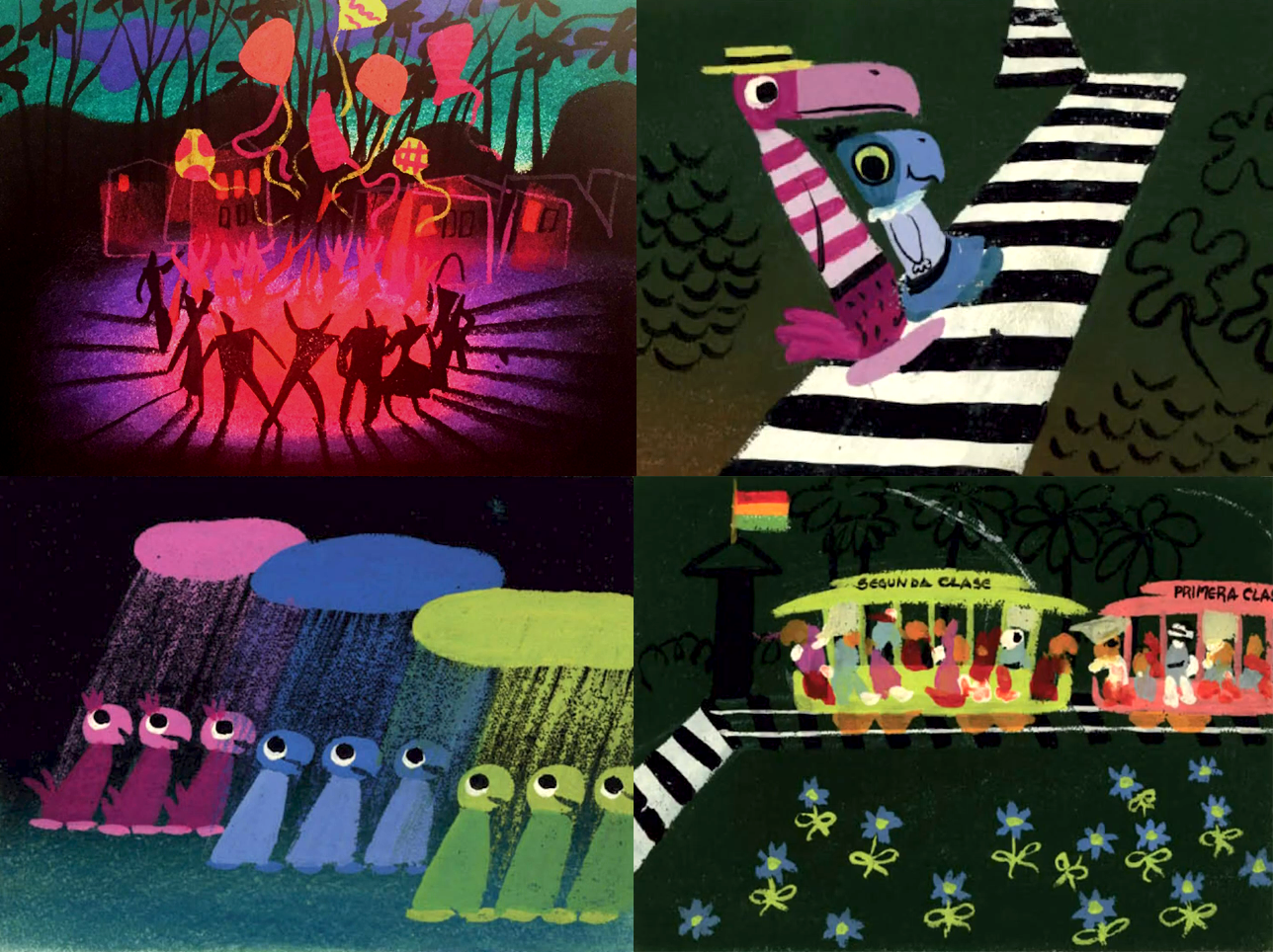
Her influence was felt as early as Saludos Amigos (1942). In fact, photos of her paintings appear on camera in that film. There and especially in The Three Caballeros (1944), the studio was already testing final artwork in line with her concept sketches.
To Disney, Blair was unique. There was a gap between him and the UPA people, and he didn’t understand modern art theories, yet he liked this stuff. “Walt was embarrassed by his lack of education but her work read to him,” said Marc Davis, one of the Nine Old Men. Disney wanted it in his films.
Many things stood in the way, though — including Disney himself.
As a general rule, Walt Disney was hesitant about modernist animation. Even when UPA first rose, the Disney team was often stuck in older aesthetics. Once the studio did update, Disney’s own feelings about it were mixed. One Hundred and One Dalmatians is among the finest uses of mid-century art in animation. Like UPA, it treats characters as drawings and designs — their artificiality (even their linework) is thrown in your face. Disney was furious. Like Ken Anderson said:
Walt was one who inherently hated lines. … He hated to see a drawing on a screen. He wanted to see them disguised ... so he was very upset when he saw what was happening on Dalmatians ... he was extremely displeased with it.
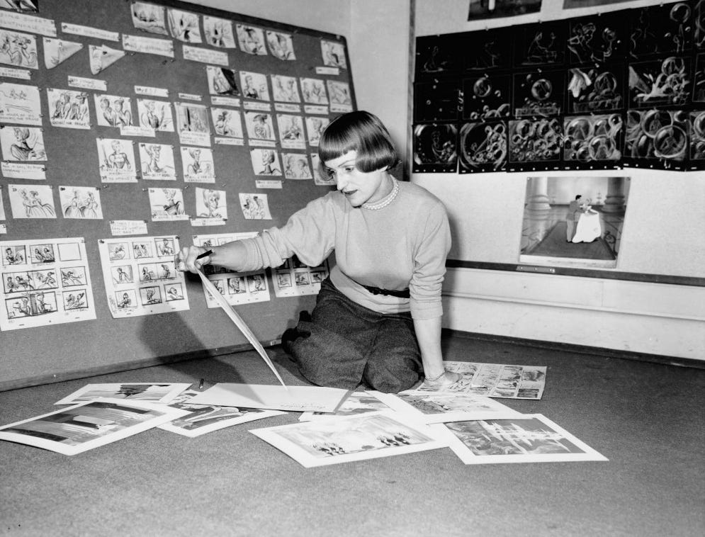
Disney’s love for Blair’s art was a bit unusual, in that sense. And, when he asked people to use it in the films, it was hard to tell what he meant. Even he didn’t quite seem to know. Wilfred Jackson (Snow White) recalled two incidents in the late ‘40s:
After the picture was finished Walt gave me a real bad time telling me how disappointed he was because I had failed to see to it that the feeling of Mary’s styling sketches was incorporated ... His scolding impressed me so much that when Mary “styled” the Johnny Appleseed picture [in Melody Time], I saw to it that the feeling of her sketches was so faithfully incorporated in that picture that when it was finished I received an equally devastating scolding from Walt for stressing the styling of the picture to a point where it inhibited the effectiveness of the animation.
It was no fluke that Blair’s work kept getting changed. Part of the reason was Disney — part of it, the idiosyncrasies of her art. And part of it was the team.
By this point, the Disney veterans knew their methods. They could do Disney-style animation better than anyone, and many were conservative about it. Ward Kimball, another of the Nine Old Men, was an exception. He loved mid-century art, hung around UPA and wanted to innovate. Watching his fellow artists grapple with Blair’s work upset him: “the great little paintings she did, nobody ever used,” he said.
As he put it at another point, “She would inspire people, but her drawings were bastardized.”
One aspect was that the veterans didn’t understand modernist techniques, even outside Blair. Kimball recalled that his peers once attempted a “modern” look just by taking a rounded, Disney-style character and squaring its edges. He compared the effect to connect-the-dots art. “That was their idea of modernism,” he said.
So, adapting an artist as specific as Blair was guaranteed to be trouble. It wasn’t only the lack of understanding that got in the way, either. Disney animation needed to emote and express and move and connect to the audience in specific ways. It was the house style, expected by viewers and demanded by Walt Disney — again, he “hated to see a drawing on a screen.” In general, characters couldn’t be drawings: they needed the illusion of life.
Pairing that with Blair’s art was hard. One side always seemed to give — either her design, or the illusion. Like animators Frank Thomas and Ollie Johnston wrote:
There were times when the dramatic or charming styles suggested [by the concept art] could not be maintained in the actual animation — to everyone’s disappointment. Possibly we were just not good enough to convert the strong designs to our type of animation, but we felt that as long as we were achieving our audience identification through sincere, believable characters in real settings (no matter how fanciful), we had to keep certain fundamentals of animation. We experimented with other types of movement that might fit the suggestions of the stylist, but they always seemed to lack life. No matter what we tried, we were never able to adapt our techniques to the restrictions of an incompatible design.
We all loved the crisp, fresh drawings of Mary Blair … Although we kept the colors, the relative shapes and the proportions, once Mary’s drawings began to move by the principles of animation that Walt had decreed they often lost the spirit of her design. It was no problem to move the drawings artistically, keeping exactly her suggestions — and some very interesting innovations came from those efforts — but as soon as it was necessary to tell a story with warmth and personality it all broke down.
Some at Disney’s studio feared that audiences would reject strictly modern animation as cold and characterless. Looking back, that’s easy to argue against. When UPA embraced characters-as-drawings and moved them in clipped, non-realistic ways, viewers loved it. Oscar-winning films like Gerald McBoing-Boing (1950) proved that people could relate to drawings, that design could tell a story.
“McBoing was a huge hit,” John Hubley later said. “The word started spreading that there was a new look to animation and Disney was finished!”
In UPA films, the leap from concept art to final product was a small one. The next few decades brought plenty of other examples. Take the early Peanuts cartoons — their style worked well enough to carry not only TV specials but a hit feature film (A Boy Named Charlie Brown, 1969). Or take Yellow Submarine, which needs no introduction. Ex-UPA people directed those projects, too, and imbued them with the UPA ethos.
But Thomas and Johnston were dealing with a real problem — one that would’ve given even UPA pause. How do you make something that’s fully Blair and a Disney project? Something that uses the strengths and toolkits of both?
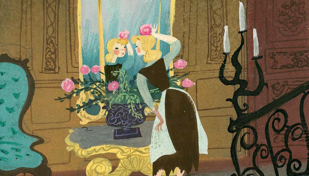
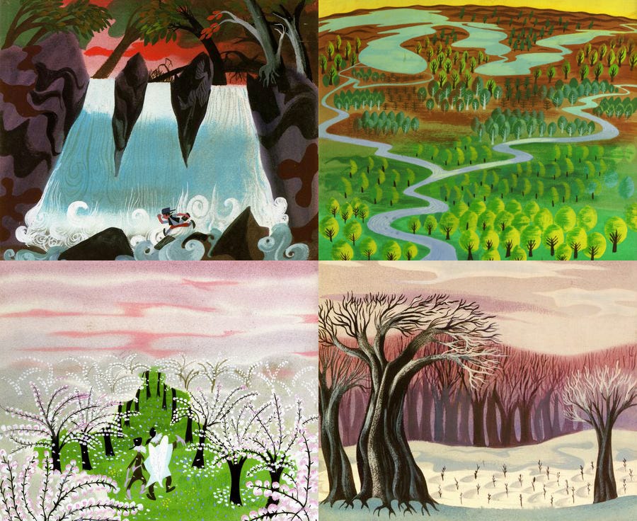
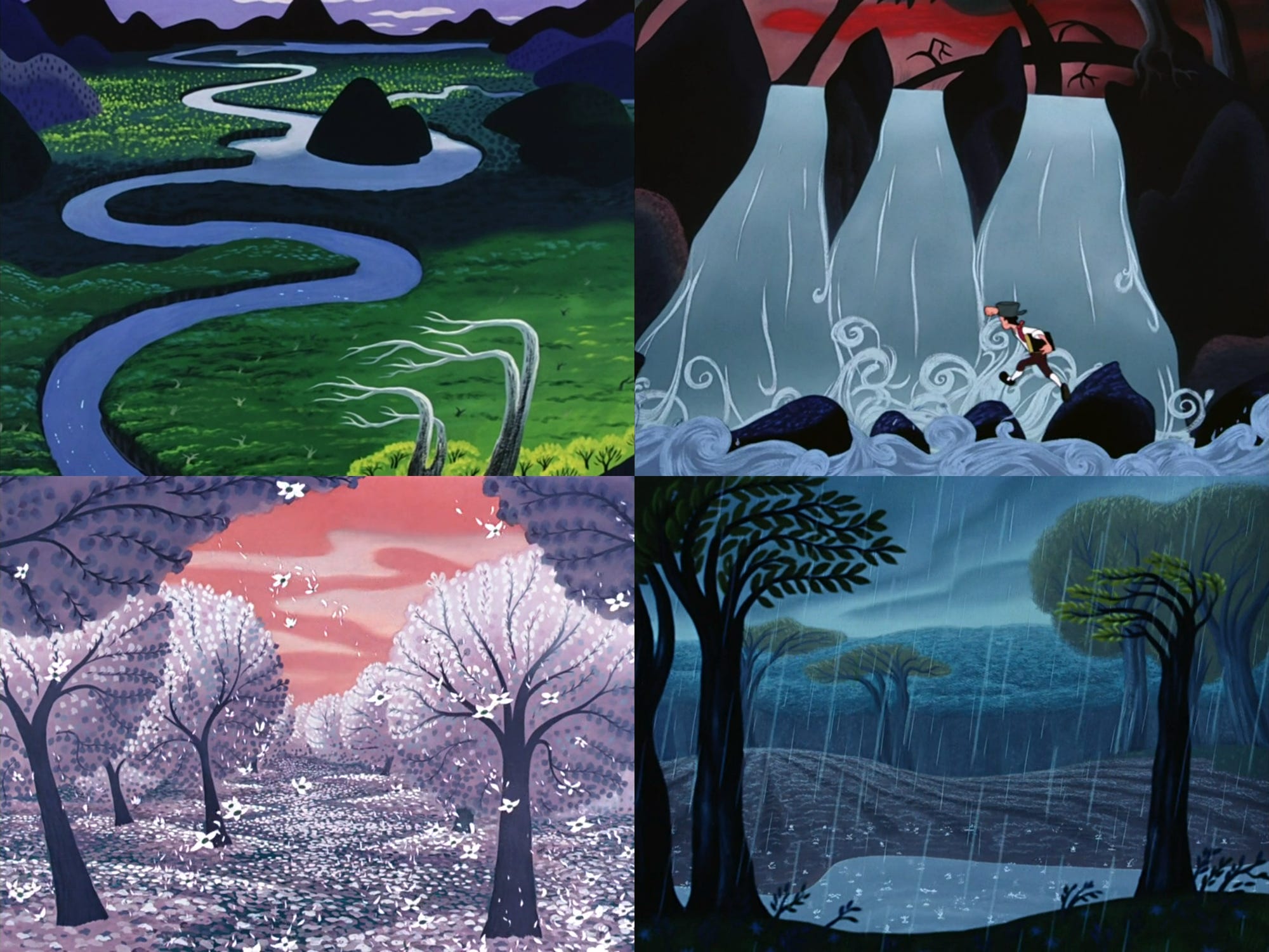
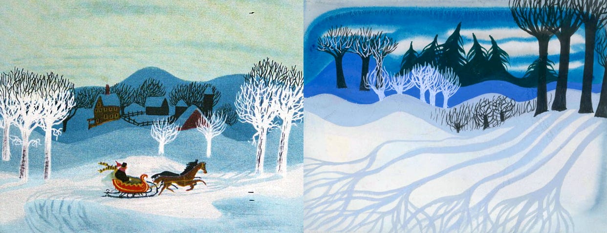
Mary Blair herself was “always frustrated that her concepts rarely made it to the screen intact,” according to historian John Canemaker. Elements showed up — sometimes in the backgrounds, sometimes in the colors, sometimes in the shapes. But deviations from the original almost always happened. The one time her style appeared fully, in her opinion, was in the train-storybook sequence from The Three Caballeros.
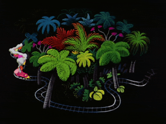
It’s a short scene of design in motion. Blair created the backgrounds herself — and the train moves like her art looks. What makes it click is that the action matches the strengths of Blair’s style. Form and content go together. Thomas and Johnston called it “essentially the animation of design elements.” In their words:
Mary Blair had made a dazzling sketch of the Brazilian jungle with a tiny, colorful train jogging along to a samba beat. Les Clark animated the train, keeping the drawing so that it matched perfectly to Mary’s overall picture. There were no demands on the animation, other than to keep the design elements in the movements … the outstanding design in the original concept contributed the most to making the sequence memorable.
It’s fun to watch — but it’s also a separate challenge than trying to sell, for example, a Blair-style Pinocchio at feature length. Disney movies called for a certain range of emotions, a certain readability of character expressions. Blair had her own skillset. The two didn’t always line up.
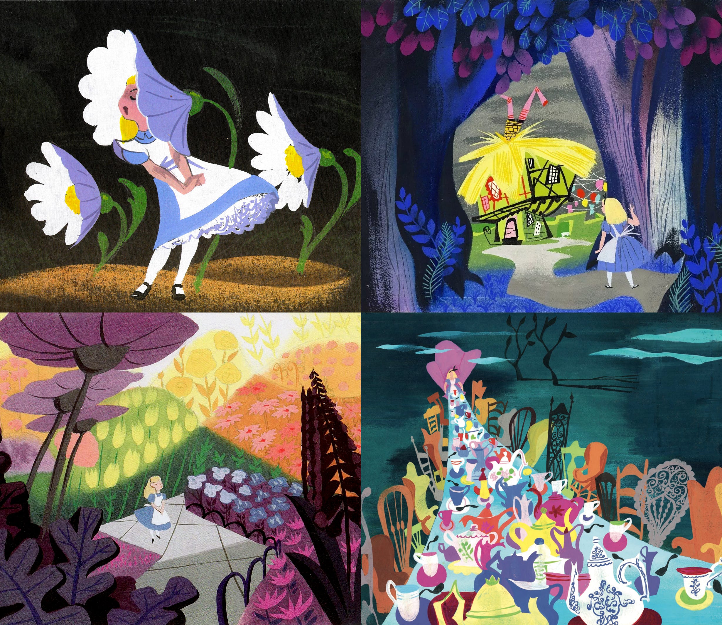
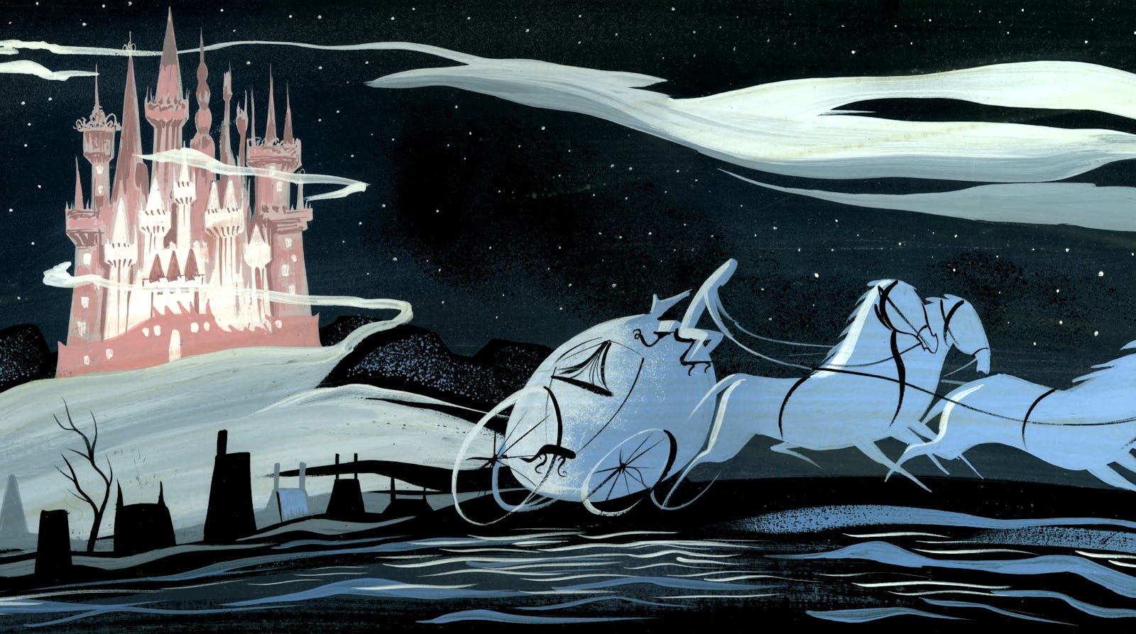
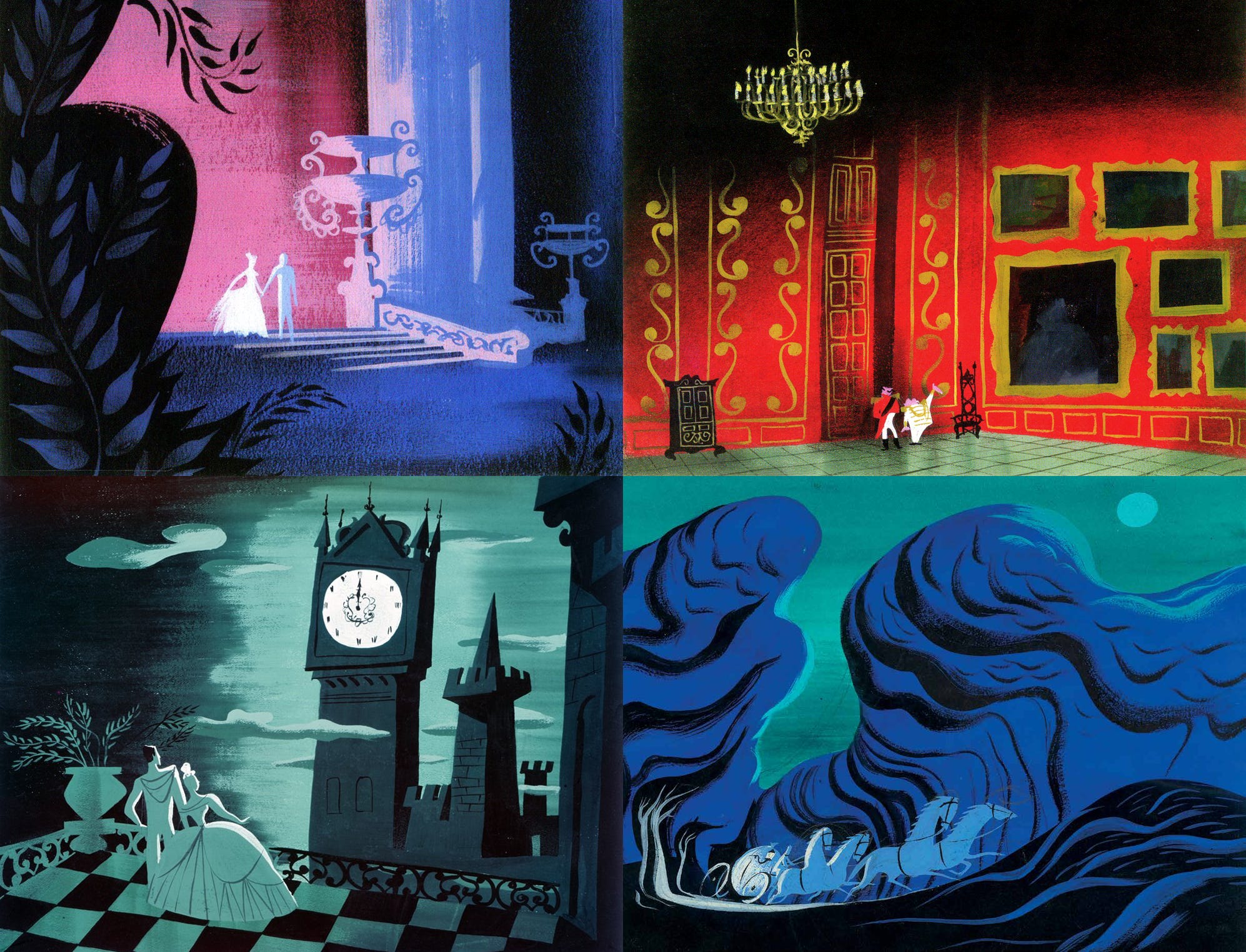
It’s hard to disagree that Blair’s design for Cinderella is more compelling than the final artwork. Could that design fit the Disney approach to storytelling, though? Would the two clash? Would a fully Blair Cinderella need to be a different movie altogether?
It’s a question to ask about the concept art for many films. Teddy Newton’s stark, mid-century collage for The Incredibles looks great, as do Annette Marnat’s ethereal paintings for Frozen II. And the teams pulled ideas from that art. But what if they’d rendered both films fully in those styles, with no deviations?
Story puts demands on design, and vice versa. A film can break down when the two don’t mesh. At UPA, inverting the looks of Gerald and The Tell-Tale Heart (1953) would’ve led to disaster. The Incredibles is an amazing story, and Newton’s collage is strong, but could they have been combined without heavy changes? Could exactly the same story beats, the same emotional range, work with collage? It’s tough to picture.
It may have been possible to create an all-Blair Disney classic. A film that really followed her art for films like Cinderella. Making it work would’ve taken more than placing her style atop the films we all recognize, though. It would’ve taken huge risks, boldly new kinds of storytelling. A wildly different type of film. Audiences might have hated it. Walt Disney might have hated it. The team, in unfamiliar territory, might have gotten lost.
Even more likely, the contradictions of the Disney studio would’ve destroyed the project before we got to see it. Which, more or less, was what happened in reality.
There were many reasons for the dilution of Blair’s style — the same is true of concept art today. On the list: studio tradition, artists’ skillsets, executive hesitance, the way movies are made. Like in Blair’s case, it’s not necessarily that studios don’t want to follow their concepts. Walt Disney and many of his people loved Blair’s art and were curious to try something new. But not every project can use every design, and not every team knows what to do with every designer.
In the words of Marc Davis, another sympathizer with modernism at the Disney studio:
This woman was an extraordinary artist who spent most of her life being misunderstood. All the men that were there, their design was based on perspective. Mary did things on marvelous flat planes. Walt appreciated this and wanted to see this, but he, not being an artist himself, was never able to instruct the men on how to use this. It gives me a warm feeling toward Walt because he was [at least] aware of that and he wasn’t trained as an artist. And it was tragic because she did things that were so marvelous and never got on the screen.
The Coraline re-release has earned over $22 million in America. Worldwide, it’s already far surpassed the box office of Missing Link, Laika’s most recent feature.
In Colombia, Semana profiled Yeisson García, who escaped poverty by learning stop-motion animation (shot on a borrowed phone). Today, he’s at El Taller del Chucho in Mexico — the studio known for Guillermo del Toro’s Pinocchio.
In Russia, a new book called Legends of the Soyuzmultfilm Studio collects more than 400 pages of interviews with Soviet animation veterans, many no longer with us.
Japanese animator Kazuya Kanehisa (Hai Yorokonde) spoke about his unusual style, how he got into animation and why he sees his work as more “archaeological” than it is “retro.”
The Glassworker, from Pakistan, screened at Hiroshima Animation Season. Its director spoke on stage with Koji Yamamura about his struggle to make the film, and the inspirations behind it — including Italian glassmaking.
On that note, Hiroshima Animation Season wrapped up in Japan. Awards went to Sirocco (from France) and Croak Show (from India’s Eeksaurus), among others.
At a time when toolmakers like Adobe are going all-in on AI, Procreate in Australia has made another choice. “We’re not going to be introducing any generative AI into our products,” pledged the studio’s leader.
YouTube and the Kremlin are fighting, and the result is a massive slowdown of the site in Russia. Viewers aren’t amused — and local studios are discussing a future where their work can’t be shared outside Russian video services.
Look Back, Japan’s cult animated movie of the year, is coming to American theaters via GKIDS in October.
Lastly, we wrote about The Mitten (1967), one of the best stop-motion films made in the USSR.
Until next time!
Read the original article
