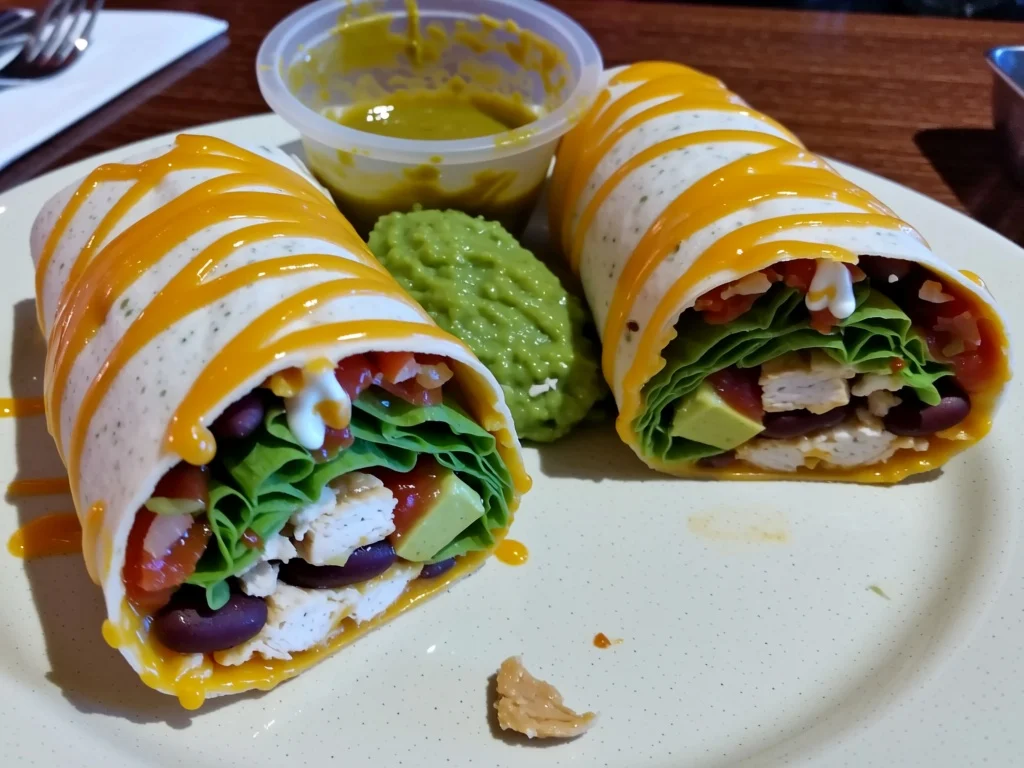
A critical benchmark for image generation models: A partially eaten burrito with cheese, sour cream, guacamole, lettuce, salsa, pinto beans, and chicken.

Read the original article
Comments
Oh wow, I've been hearing about Nano Banana Pro in random stuff lately, but as a layman the difference is stark. It's the only one that actually looks like a partially eaten burrito at all to me. The others all look like staged marketing fake food, if I'm being generous (only a few actually approach that, most just look wrong).
By recursivecaveat 2025-11-263:411 reply I don't know if it's the abundance of stock photos in the set or the training, but the 'hypertune' default look of AI photos drives me crazy. Things are super smooth, the colors pop wildly, the depth of field is really shallow, everything is overly posed, details far too sharp, etc. Vaguely reminds me of the weird skin-crawler filter levels used by people like mr beast.
I think it is the fine tuning, because you can find AI photos that look more like real ones. I guess people prefer obviously fake looking 'picturesque' photos to more realistic ones? Maybe it's just because the money is in selling to people generating marketing materials? NB is clearly the only model here which permits a half eaten burrito to actually appear to have been bitten.
By beefnugs 2025-11-264:16 This is what we deserve for not burning to the ground every company with fake food ads as soon as it started
Hunyuan V3 is the only other one that plausibly has a bite taken. The weirdness of the fillings being decoratively sprinkled on top of it does rather count against it, though.
By andai 2025-11-260:12 Hide the evidence!
By Workaccount2 2025-11-262:07 Someone on reddit made a "real or nano banana pro image" website for people to test if they could spot generated images. The running average was 50% accuracy.
It looks like they took the page down now though...
By BoorishBears 2025-11-260:392 reply This shows some gaps in the "same prompt to every model" approach to benchmarking models.
I get that it's allows ensuring you're testing the model capabilities vs prompts, but most models are being post-trained with very different formats of prompting.
I use Seedream in production so I was a little suspicious of the gap: I passed Bytedance's official prompting guide, OPs prompt, and your feedback to Claude Opus 4.5 and got this prompt to create a new image:
> A partially eaten chicken burrito with a bite taken out, revealing the fillings inside: shredded cheese, sour cream, guacamole, shredded lettuce, salsa, and pinto beans all visible in the cross-section of the burrito. Flour tortilla with grill marks. Taken with a cheap Android phone camera under harsh cafeteria lighting. Compostable paper plate, plastic fork, messy table. Casual unedited snapshot, slightly overexposed, flat colors.
Then I generated with n=4 and the 'standard' prompt expansion setting for Seedream 4.0 Text To Image:
They're still not perfect (it's not adhering to the fillings being inside for example) but it's massively better than OP's result
Shows that a) random chance plays a big part, so you want more than 1 sample and b) you don't have to "cheat" by spending massive amounts of time hand-iterating on a single prompt either to get a better result
By vunderba 2025-11-260:53 100%. Between tuning prompt variations depending on the model and allowing a minimum number of re-rolls, this is why it takes a while to publish results from the newest models on my GenAI comparison site.
Including a "total rolls" is a very valuable metric since it helps indicate how steerable the model is.
By pathdependent 2025-11-260:511 reply not adhering to the prompt guide is def a valid strong criticism. resampling i think less so for the demo just because fewer people look at k samples per model, so just taking literally the first one has the fewest of my own biases injected into it
By BoorishBears 2025-11-261:06 I actually think it's ok to inject your own bias here: if you're deploying these models in production, then you probably test on your own domain other than half eaten burritos lol
But individual users usually iterate/pick, so just sharing a blurb about your preference is probably enough if you choose 1 of n
By iambateman 2025-11-262:26 That’s what I came here to say! Oh my goodness it’s a huge difference.
The “partially eaten” part of the prompt is interesting…everyone knows what a half-eaten burrito looks like but clearly the computers struggle.
The NBP looks like a mock of food to me - the unwrapped burrito on a single piece of intact tinfoil, a table where the grain goes all wonky, an almost pastry looking tortilla, hyperrealistic beans and there's something wrong with the focal plane.
It's just not as plasticy and oversaturated as the others.
Hyperrealistic beans? The focal plane? You are reaching really hard here.
The table grain is the only thing that gives it away - if it weren't for that no one without advance warning is going to notice that it's not real.
By PostOnce 2025-11-261:09 I am a huge AI skeptic, check my comment history.
I agree with you. The Nano Banana Pro burrito is almost perfect, the wood grain direction/perspective is the only questionable element.
Almost no one would ID that as being AI.
Yeah, hyperrealistic beans. They don't look real at all. The inside of an actual burrito is messy after you bite into it (and usually before). That burrito has a couple of nearly dry, yet for some reason speckled, beans that look more like they're floating on top of the burrito rather than actually in it.
And yeah, the focal plane is wonky. If you try to draw a box around what's in focus, you end up with something that does not make sense given where the "camera" is - like the focal plane runs at a diagonal - so you have the salsa all in perfect focus, but for some reason one of the beans which appears to be the exact same distance away, is subtly out of focus.
I mean, it's not bad, but it doesn't actually look like a real burrito either. That said, I'm not sure how much I'd notice at a casual glance.
By flir 2025-11-262:25 Re: focus. It looks like a collage - like the burrito has been pasted in. The Nano Bana 1 image doesn't have that problem.
By blinding-streak 2025-11-261:25 Very impressive, nano banana pro has this this wrapped up. The other ones look like has-beans.
One of my tests for new image generation models is professional food photography, particularly in cases where the food has constraints, such as "a peanut butter and jelly sandwich in the shape of a Rubik’s cube" (blog post from 2022 for DALL-E 2: https://minimaxir.com/2022/07/food-photography-ai/ )
For some reason ever since DALL-E 2, all food models seem to generate obviously fake food and/or misinterpret the fun constraints...until Nano Banana. Now I can generate fractal Sierpiński triangle peanut butter and jelly sandwiches.
Nano-Banana does a (inter)stellar job with food based prompts.
By morkalork 2025-11-262:38 Make you wonder if they're using all the restaurant review photos on google maps to train
By BoorishBears 2025-11-260:491 reply I tried having Claude generate a prompt for Seedream and got this: https://imgur.com/a/6xX5TDE
I can kind of see what you mean in that it went for realism in the aesthetics, but not the object... but that last one would probably fool me if I was scrolling
By minimaxir 2025-11-260:53 Those are better than usual: I've gotten generations from earlier models that are just a normal colorful Rubix's cube between two slices of bread.
