Something truly monumental happened in the world of software development in 2025. Safari shipped a reasonable implementation of text-wrap: pretty: https://webkit.org/blog/16547/better-typography-with…
Something truly monumental happened in the world of software development in 2025. Safari shipped a reasonable implementation of text-wrap: pretty: https://webkit.org/blog/16547/better-typography-with-text-wrap-pretty/. We are getting closer and closer to the cutting-edge XV-century technology. Beautiful paragraphs!
p {
 text-wrap: pretty;
 text-align: justify;
}
looks alright. It’s just the combination of the two that is broken.
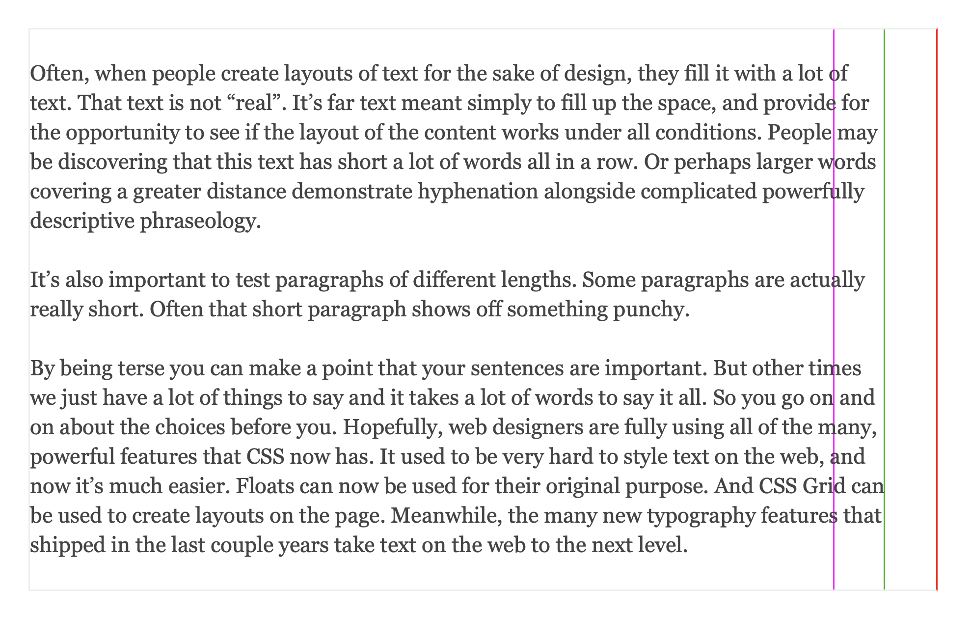
This behavior is a natural consequence of implementation. My understanding is that the dynamic programming scoring function aims to get each line close to the target width, and is penalized for deviations. Crucially, the actual max width of a paragraph is fixed: while a line can be arbitrary shorter, it can’t be any longer, otherwise it’ll overflow. For this reason, the dynamic programming sets the target width to be a touch narrower than the paragraph. That way, it’s possible to both under and overshoot, leading to better balance overall. As per original article:
The browser aims to wrap each line sooner than the maximum limit of the text box. It wraps within the range, definitely after the magenta line, and definitely before the red line.
But if you subsequently justify all the way to the red line, the systematic overshoot will manifest itself as too wide inter-word space!
WebKit devs, you are awesome for shipping this feature ahead of everyone else, please fix this small wrinkle such that I can make my blog look the way I had intended all along ;-)
Prettyness is important, but legibility is more important.
I don't know why we're still obsessed with right justification? In 1450 it made a lot of sense to try to squeeze the most text on a page, but today it isn't?
Justify is not only useless but it's also responsible for creating all those white spaces of various length, which are annoying enough by themselves, but which can also create "rivers" which become an incredible distraction.
The first thing I do with a new ebook is to modify it in Calibre so that it's left-align instead of justify.
Maybe "pretty" is a solution, but non-justify is simpler, and readily available.
There is no mention of it in the post. If words (in any language) can be arbitrarily long and columns can be arbitrarily narrow, we will need to solve for this anyway.
Even without those extremes, I feel that there will always be place for the good old hypen when displaying or printing text for the main purpose of readability. No need to max out on perfect "look" in every application of text.
In fact in many places one might even find columns with jagged right edges more readable -- letting you visually distinguish each line from the one above/below it easily by length alone -- and may even lend a certain aesthetic character that is the opposite of mechanical / boring / machine produced / sterile.
Of course not negating the need for a well implemented method without bugs to justify text correctly when the use case demands it.
What is an example of a "high-end page-layout program" referenced in that document? I mean, of course I assume they exist for professional type setting, book publishing and such, but I have never seen or heard of the actual software.
We used Adobe InDesign at my last work, which I believe is an industry standard. Affinity Layout if you don’t want to sell your kidney to Adobe. Scribus is an open source project but I’m not sure how the quality is in that.
> Scribus is an open source project but I’m not sure how the quality is in that.
I am not a typographer, and I’ve never used it in a professional capacity, but v1.6 (early 2024) improved Scribus a lot. I’ve used it and liked it for some personal projects for years, but the improved typography in 1.6 is big.
There is only Adobe InDesign. Even though you can make high quality layouts in other programs (Affinity, Scribus) once you get to actually printing in pro printer the whole pipeline is InDesign. It's Adobes secret money printer, software that many don't realize it rivals Photoshop in usage.
No, the pro pipeline is PDF. You might argue that, if you are risk averse, you only trust Adobe’s tools to produce optimal PDF. This is of course Adobe’s moat. But Scribus’ export to pdf is excellent, in a pro setting
Thats not what I am talking about. Your PDF might be identical but printers often require either their specific InDesign settings or straight up packaged InDesign project as source for printing (they used to require postscript lol).
I am not gonna argue if they are correct or not but the reality i've experienced is that at minimum socially the printing industry is married to InDesign.
Thanks for that link! There is a bit more ... justification (pun intended) on that page for this recommendation to turn-on hypenation; and also some valuable advice on choosing spacing between words over spacing between letters.
The problem is knowing when to do it. The lang attribute and Content-Language header may not always be reliable. Authors mostly aren't using the WBR element.
Hyphenization is language and content-dependent. You need different rules for English and French text, for example. Moreover, it doesn't fit the "short paragraph style" most non-academic text is written in these days.
Hyphenation will probably lead to people thinking the content is generated by AI, which would be a significant downside for most websites. Users want to believe the site creator put effort in (regardless of whether they did or even if it's appropriate to have done.)
TFA also isn't talking about code comments, but considering the comment chain I'd like to point out that the only times I've seen hyphenated words there is when I'm pretty sure they were LLM generated... So... Unless the position for the hyphenation changes depending on the resolution (or page layout like with latex), I'd personally still guess an LLM was involved, honestly.
> We are getting closer and closer to the cutting-edge XV-century technology. Beautiful paragraphs!
While the broader point is fine, the example to me is just bad to me: very narrow column with a lot of hyphens and identical width/no variety making it harder to anchor your eye (though colored letters are awesome and play this role)
Ok, bad rag is bad, but the ancient text goes overboard in the other direction. This looks close to the form-over-function vibe.
> Incipit epistola sancti iheronimi ad paulinum presbiterum de omnibus divine historie libris capitulum primum.
I'm not entirely up on all the abbreviations and and shorthand used in medieval manuscripts, but the macron over the final ū in 'capitulū' indicates the vowel being nasalized, which often happens before the final 'm' consonant which in this case is suspended. The 'pmū' is similar, but also I think a contraction or abbreviation for primum. With all these tricks available to the scribes it's no wonder they can make the right edge look nice.
I guess it’s safe to say that you can read Latin? What I’m trying to figure out is whether the typography in the Gutenberg Bible was exceptional for its time.
So I guess the fairer question may be whether Germans would’ve found Latin difficult to read in blackletter/Gothic type, which apparently descends from Roman cursive anyhow.
I asked my initial question (whether the grandparent commenter understood the language) because I wanted to figure out whether criticizing the typography as “form-over-function” made sense.
The problem is not the use of blackletter, but the narrow spacing and copious use of abbreviations to cram the text into two rectangular columns. That was certainly not an unusual goal to have, and you can see the same in handwritten manuscripts https://commons.wikimedia.org/wiki/File:Bible.malmesbury.arp... though executed less perfectly, but that doesn't mean it's not form-over-function.
I gather that form-over-function is not as binary as I imagine. That and I’m at fault for assuming that because that style of typography was prevalent people enjoyed reading it or found it legible.
It's latin. "de omnibus" on the second line is pretty well recognizable. But holy hell is Gutenberg's font terrible. Look at the first word on the second line, it ends in seven undotted sticks that seem to bleed over into each other a bit. I read that as "mim" before I figured out it was "num".
Anyway, it's the Gutenberg bible. The epistle of St. Jerome, according to the alt text.
The interface also allow to comment, post and interact with the original HN platform. Credentials are stored locally and are never sent to any server, you can check the source code here: https://github.com/GabrielePicco/hacker-news-rich.
