A release announcement showcases how the user’s experience is better today than it was yesterday. That sounds obvious, but most release announcements seem to forget that there’s a user at all.
So many release announcements just enumerate new features in a way that’s totallly divorced from how real people use the software. The announcement is essentially just a changelog with better writing.
For example, here’s a “changelog” style of announcing a new feature:
- Added “duplicate” button to the event menu.
Don’t just tell the user that there’s a new button. Tell the user what they can do with that button.
When you create a new event, chances are that the first thing you do is copy/paste information from an existing event. Creating events this way is tedious and slow, so we’re sparing you this toil with the new Duplicate feature.
When you need to create a new event based on an existing event, go to the existing event, and select Options > Duplicate. Duplicating events is 10 times faster than copy/pasting fields.
Note that the example doesn’t boast about what the software can do. It tells the user what they can do with the software. It speaks directly to the user, describing what happens when “you” create events.

The second screenshot draws the reader’s focus more clearly by using a tighter crop and adding an arrow indicator to identify the relevant part of the UI.
Keep animated demos short and sweet🔗
Good news: modern browsers support media formats for playing high-quality screen recordings. We’re long past the days of washed-out, pixellated GIFs and clunky YouTube embeds.
- Animated images: WebP and AVIF image formats can show GIF-like animated images, and they enjoy wide browser support.
- Embedded videos: H.264 and WebM-encoded videos play natively in the browser with a simple
<video>tag. No third-party client library required.
Aim to keep demos under five seconds. 15 seconds should be the maximum. This is both for the sake of respecting the reader’s time and your server’s bandwidth. Nobody wants to sit through a two-minute video about a dialog box.
Plan your release announcement during development🔗
At my last company, I was in charge of both release planning and release announcements.
I once dedicated an entire release to overhauling our product’s self-update feature. The update code was so messy that it took five months to replace it, twice the turnaround of our typical release.
When I finally wrote the release announcement, I realized I’d screwed up: nothing in the release benefitted our users. Sure, future releases would be faster and less error-prone, but the user’s experience today was no better than it was yesterday.
I awkwardly tried to explain to our users why we made them wait five months for a release that essentially did nothing for them. I promised that they’d benefit from these changes soon, as the new update system would accelerate development (and it did), but I was embarrassed that the release primarily made life better for our developers rather than for our users.
From then on, I always considered the release announcement early in release planning. Given the tasks I planned for a sprint, I identified the ones that would be exciting and valuable enough to the user to include in the release announcement. By planning the announcement early, I thankfully avoided ever writing another uncomfortable explanation of a release that offers nothing to the user.
Real-world examples of compelling release announcements🔗
Gleam JavaScript gets 30% faster🔗
The release announcement for Gleam 1.11 puts the flagship feature right in the title: a 30% performance improvement. The title makes it crystal clear that the announcement focuses on what the user cares about.
The Gleam release announcement describes every feature in terms of how it makes life easier for their users. They never bore the reader with a dry list of changes. The announcement accompanies every change with code snippets showing how each change in the language and toolset has made life better for Gleam developers.
Navigating UI3: Figma’s new UI🔗
Figma is a design tool that earned a strong reputation for its relentless focus on user experience. This same focus is evident in their release announcements.
Figma’s UI3 release announcement presents each feature in terms of the user’s experience. Rather than saying, “This button is now here, and we added this dialog,” they tell the user “You can now do X to achieve Y.” They don’t just explain what changed; the showcase how the change benefits the user.
My only criticism is that Figma’s release announcement bizarrely uses 8 MB GIFs (yes, multiple) to show 5-second demo animations.
- Highlight new features and changes that excite the user.
- The exhaustive accounting of every change belongs in the release notes, not the release announcement.
- Describe changes in terms of what improved rather than what is no longer bad.
- Leave out vague descriptions like “various improvements and bugfixes.”
- Use screenshots that make the new feature obvious even if the reader doesn’t zoom in or read the surrounding text.
- Include animated demos, but keep them under 15 seconds.
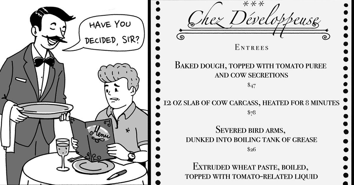
“Chez Développeuse” illustration by Piotr Letachowicz.
