
Comments
Steve Jobs is famous for his 1996 quote about Microsoft not having taste (https://www.youtube.com/watch?v=UiOzGI4MqSU). I disagree; as much as I love the classic Mac OS and Jobs-era Mac OS X, and despite my feelings about Microsoft's monopolistic behavior, 1995-2000 Microsoft's user interfaces were quite tasteful, in my opinion, and this was Microsoft's most tasteful period. I have fond memories of Windows 95/NT 4/98/2000, Office 97, and Visual Basic 6. I even liked Internet Explorer 5. These were well-made products when it came to the user interface. Yes, Windows 95 crashed a lot, but so did Macintosh System 7.
Things started going downhill, in my opinion, with the Windows XP "Fisher-Price" Luna interface and the Microsoft Office 2007 ribbon.
By AnotherGoodName 2026-03-010:579 reply I'll also give the opinion that Apple consistently creates some absolutely crap designs and when they do this, release something really really mind mindbogglingly stupid that it should be embarrassing they are instead met with applause on the "amazing design". It's a tiresome pattern repeated for decades now.
eg. The 'breathing status light' that lit up the room at night due to extreme brightness which meant every macbook of the era had stickers or tape over the LED with endless Q&A's of "How do i turn the annoying light off? You can't!". This crap design was met by articles extolling the subtle sign wave and off white hue. I kid you not. https://avital.ca/notes/a-closer-look-at-apples-breathing-li...
Apple today seem to have acknowledged their mistake here and taken away status lights completely (also a crappy design hailed as amazing since they've just gone to the other extreme) which highlights the fact that no matter what they do they're hailed as being amazing at design, even when it's contradictory from their own previous 'amazing designs'.
Apple doesn't just get a pass on crappy design. It gets endless articles praising the virtues of everything they do even when, if you think about what they did for even a second you'd realize, "that's actually just plain crap design".
> release something really really mind mindbogglingly stupid that it should be embarrassing
I’m still trying to understand who came with the idea of charging the mouse from under, instead of from a position that would allow to use the mouse while charging…
I believe that was intentional, to prevent people using it plugged in, which would mean most people would keep it plugged in all the time, so it wouldn't be a wireless mouse anymore, but also degrade the battery lifespan.
I also believe that was intentional. But the reason was the typical Apple / Jobs hubris of knowing better than the users. The desktop looks cleaner with fewer cables, so they wanted to enforce use without the cable plugged in.
I don't have a source for this, but I'm pretty sure I've read something like that a long time ago.
By expedition32 2026-03-0210:45 As someone who doesn't give a flying fuck about design this is exactly what bothers me with Apple.
Computers are not fashion or status symbol they are a tool. Although I do have a "ice" motherboard..
By chocochunks 2026-03-0117:22 It was intentional to recycle the design of the Magic Mouse 1 which used AA batteries. The Magic Touchpad and Keyboard came out the exact same day as the Magic Mouse 2 and they don't share the Magic Mouse 2's stupid design. They both have perfectly usable ports on the front and even work when wired without pairing.
By benj111 2026-03-0118:03 Right.... So.... Add some charging circuitry. Is it a problem if people don't use it as a wireless mouse anyway.
Yes it's very apple to force users to use devices how Apple wants, but that isn't a particularly good reason.
Maybe they should have made the batteries replaceable and make it operable without batteries installed.
Or just ship a wired version for the people who want that.
By bombcar 2026-03-0117:49 That wired hockey puck mouse was an abomination
By userbinator 2026-03-0120:38 Cycling the battery continuously is worse for lifespan.
Textbook case of form over function. Either an engineering constraint forced by the design and deemed an acceptable trade-off by higher-ups, or maybe more likely, the designer just thought a visible charging port would’ve ruined their design.
While the exact reason has never been documented, if you look at that mouse's design, you'll see that its first generation had a regular battery compartment on the bottom. When gen 2 arrived, they fully reused the same shell and only replaced that bottom part to now be an integrated battery with a charging port instead of a compartment for AAs. Moving the charging port would've required a brand new design, since every edge of the mouse tapers way too much for a port to be placed anywhere else. They would also probably need to change more of the internal structure, as opposed to just swapping a battery module and changing the bottom lid. In this case the constraint seems to just be about functionality and manufacturing. Apple has made many controversial design decisions that have no functional justifications in the past, yet people keep bringing up the mouse.
By throw_away_623 2026-03-018:075 reply The reason people talk about the mouse is that it's one of the worst ideas they ever had.
At the time, I remember someone claimed that the reason was that they were afraid people could leave it plugged in for convenience. Apple thought that would lead to a worse experience because their mouse was designed to be used wirelessly. I think it was actually more related to aesthetic "icks" by the designers, because people would have disconnected the cable if it was in the way.
This is not even close to the worst ideas Apple ever had, even if you're only talking about mice.
The original USB mouse (for the first iMac) was round, so you couldn't orient it in your hand without looking at it constantly.
And it came with a very short cord (because there was a port on the right side of the keyboard to plug it into). But then the laptops got updated with USB ports and they were only on the LEFT side of the case.
For at least a year or two you could not buy an Apple mouse for your Apple PowerBook and use it in your right hand, because the cord was too short to go around the case.
Eventually they shipped a "Pro" mouse with revolutionary elongated shape and longer cord. (...and optical tracking, and what looked like zero buttons, which were pretty neat)
By CableNinja 2026-03-0121:18 Uhg i totally forgot about their round mouse. Bright colored iMac days!
By jbverschoor 2026-03-0110:06 Yet it is one thing I love very much about my MX anywhere 3. The wire connection is simply more performance and I get to use it when I did not charge. It is also compatible with any non-Bluetooth device.
> I think it was actually more related to aesthetic "icks" by the designers, because people would have disconnected the cable if it was in the way.
A lot of people really will just anxiously leave the cable in the whole time if given the opportunity. I have a wired/wireless Logitech mouse and I confess that I hardly ever remove the cable. Between this, and the space and connector issues of adding a "normal" cable connection as referred to in the grandparent, we have two reasons to think that Apple's decision wasn't all that clearly bad, let alone one of their worst.
Nobody leaves the cables attached. Except wanna be pro gamers who think a couple milliseconds will help them more than practice to "git gud". Every mouse I have is wireless, and I almost never use them plugged in, except for the one on the server that get used so rarely it's self-discharged should probably be wired but I simply don't have any wired ones left. Just plug them in overnight every once in a while, golden.
By leoc 2026-03-023:20 But what's your basis for assuming that everyone has your habits in this respect?
By specialist 2026-03-0112:17 > it's one of the worst ideas
It's still one of the worst ideas. Insult to injury.
Honestly, as a user of the mouse, I think the main reason people talk about the mouse is bike shedding. Charging isn't a problem in actual use, but everyone sure has an opinion on it.
There are plenty of contenders for 'worst ideas they ever had' and this just isn't up there.
By kmeisthax 2026-03-0117:40 "If you see a stylus, they blew it"
That's a quote from Steve Jobs about how basically all of their competition (except Google) had made the mistake of trying to ship desktop software on phones. The problem with the stylus is that it's a hardware workaround for a software problem: the sort of cost-reduced engineering you get when a company wants to "have a mobile strategy" without actually putting in the time and effort to make something good.
The Magic Mouse is the exact same kind of "we couldn't care less" cost-reduction. The charging port is on the bottom because that's the only place you can put a charging port with the existing all-glass design. Because they re-used an existing design intended for removable batteries. This is such an uncharacteristically un-Apple move, and one so obviously detrimental to the design of the device, that people (including myself) actually psyopped themselves into thinking Apple had deliberately designed the mouse to enforce wireless usage.
And, to be clear, Apple has never done that.
All their other peripherals with rechargeable batteries in them will let you use them fully wired if you plug them in. In fact, if you somehow engineered a way to move the charging port somewhere less stupid, the Magic Mouse probably would work plugged-in, too.
If you see a charging port on the bottom, they blew it.
I agree, I always found the charging port location to be a total non-issue. The battery life is long, charging is fast, and you get warned that the battery level is low long before the mouse dies.
By alexdbird 2026-03-0111:20 In fact, the real crime of the Magic Mouse is how awkward it is to switch it between machines.
By moron4hire 2026-03-0112:27 While I get the feeling you appreciate the, erhm, efficiency with which Apple modified this product, the problem is that Apple is not supposed to be efficient. They don't need to save money on the engineering process because they are not hurting for money. They sell themselves as being a design-forward company that prides itself on making bold, not expedient, choices. To take a shortcut like that shows a lack of respect for the customer to whom they are charging premium prices for these items.
By benj111 2026-03-0118:08 So if they're reusing the shell, they passed the savings on to customers right?
If this were a £10 mouse then this excuse might be valid, but it isn't.
By userbinator 2026-03-019:09 Where should a cord on a mouse be when it's charging? The same place as any cord on a mouse should be, i.e. the tail, would be the commonsense answer. Indeed this is how all other dual-mode mouses do it.
How many generations of that mouse design have there been now? Any changes to it? Wireless charging support could be a nice bandaid on that terrible design.
By gandalfian 2026-03-021:422 reply Modern wireless mice from logitech and microsoft last for a year or two on a pair of aa batteries. There is no point making them rechargeable any more. You can always use rechargeable aa nihms if you really want to, but personally I just have 50p of alkaline aa's and in two years I will have to change them again. Some things do get better :)
By f1shy 2026-03-0217:58 The only point IMHO to built in battery, is if it very convenient to recharge, which is not the case. I have an HHKB which uses 2 AAA, with rechargeable Li batteries which I can reload with usb, while still using the keyboard with cable (once every 6 months or so)
By expedition32 2026-03-0210:51 AA batteries have also immensely gone down in cost compared to the 1990s.
By specialist 2026-03-0112:041 reply Their laptop touchpads are the only Apple "pointer" input device I've ever liked. (And by extension, the iPhone and iPad.)
I hate myself every time I settle for yet another disposable Microsoft mouse.
Though, I would have killed for an Apple Pencil, back when I was a CAD jockey.
For me, the butterfly keyboard was Apple's mostest worstest user interface design decision.
(Doubly so because it persisted for so long. I love that Apple (and others) try new things. But I don't understand commitment to design failures.)
Source: I've been an Apple partisan since the Apple ][. Even stubbornly resisting Amiga's siren call.
> For me, the butterfly keyboard was Apple's mostest worstest user interface design decision.
I really liked the butterfly kb. It was responsive, and you could hit the key cap anywhere and it would register.*
Subsequent mac book keyboards imo are all terrible and suffer from the terrible issue of sponge-ness that means i can literally press a key cap in a slightly off centre location and it Does Not Register. Its like the key movement is separate from the actuation. I have way more mis key and missing letter using later post butterfly kbs than i ever did. The worst part is this is ‘normal’ and not a fault. You just have to press harder and in the centre.
* except when it was in for work i had 3x top case replaced on my old mbp
By specialist 2026-03-0113:141 reply Ya, you're right. When it worked, it worked well. A point worth remembering, thanks. Alas, they just weren't robust enough, interferring with my work.
By just6979 2026-03-020:18 "when it worked, it worked" is one of the weakest excuses possible, and one Apple themselves railed against many times. Not working at all (ie: broken) is quite worse than not working beyond perfectly.
Who cares if you can't press a key on the very edge, as long as pressing in the proper spot _always_ works? The one that did accept blatant mis-presses was broken often enough to completely overwhelm any benefits, because it can't accept _any_ presses when it's in for repairs!
"I like the keyboard that let me be a bad typist, even though I had to get it replaced 3 times, and that lack of robustness actually interfered with my work." Are you listening to yourselves?
By sandermvanvliet 2026-03-018:47 Let me introduce you to the world of _devices for keeping small kids asleep_.
For whatever reason they won’t work when hooked up to a charger and of course the moment you need them most the batteries have gone dead so you must charge…
At this point I can’t help but think that the people who design these things really hate parents
By cosmic_cheese 2026-03-013:321 reply I liked the gentle amber sleep mode breathing power button on my circa-2000 CRT iMac. It wasn’t nearly as bright as that of later models and was quite nice.
I had one from 2010 and the bright light wasn't even the main problem at night.
The charger emitted an annoying high pitch sound so I'd have to unplug it.
And the device turned itself on randomly at night, and the CD-ROM reader and fans would spin up and make noise.
I've now used a macbook air for work and I noticed that even when in "standby" for a week my router had a DHCP lease for it. So they still turn on for no reason, but at least the lack of fans and the fact that I can now use a decent usbc charger means they don't wake me up any more.
By jaffa2 2026-03-0112:37 You can disable it but yes macs will periodically wake up to get emails and notifications even while they are ‘sleeping’
By windowsrookie 2026-03-0116:252 reply You can disable "Wake for Network Access" in the battery settings if you want. It's a convenience option that lets MacOS check for new iMessages and other updates while it's asleep. That way all your messages are loaded immediately when you wake the device.
Do they have network performance problems such that messages need to be preloaded? Can't just fetch the new ones at wake up? That is a solution in search of a problem. I go from phone to laptop/desktop and continue messaging on various services all the time, and none of them sync until wake up and that's perfectly fine.
By LtWorf 2026-03-026:55 I presume apple wants to collect the data.
By LtWorf 2026-03-0117:21 I didn't even set it up with an apple account and thus I cannot possibly get any messages from iMessages.
By LtWorf 2026-03-0121:30 I love how when americans wake up simple factual statements get downvoted because they are somehow seen as personal insults.
Feel free to downvote, this one is meant for it :)
By wolvoleo 2026-03-0111:21 Yes or the sharp edges on MacBooks cutting into your wrist. That started with the unibody design, the ones before that had a nice soft rounded plastic gasket there
My powerbook was the last apple laptop I really enjoyed.
By throwaway290 2026-03-011:191 reply I got no problem with that tiny LED or glowing apple logo personally
But liquid glass and insane amount of bugs that arrived with it is killing me.
By AnotherGoodName 2026-03-011:222 reply Likely you experienced later gens where they toned it down. ~2010 it was one of the brightest LEDs you could purchase. As in they literally put a torch LED on the all white Intel macbooks of the era and it would shine through the laptop bags, pulsating.
By IncreasePosts 2026-03-014:58 There's people who live their lives with the low battery beep on their smoke alarm going off every 5 minutes in their home and don't even register it happening.
By throwaway290 2026-03-011:231 reply Maybe...
Not Maybe, I owned a 2009 MBP. Everyone with a macbook from that period that I knew had the same issue, they were absurdly bright, you could not keep it anywhere near a bedroom without putting very thick tape over the light.
It was a poorly thought out design of aesthetics over ergonomics.
By throwaway290 2026-03-012:28 nope. actually I remember I had that model first and yes I still don't care. simply the least annoying light compared to other bright color leds in a room. doesn't stand close to liquid glass chaos.
loved battery level indicators on old macbooks too, they kind of brought it back with led on magsafe except this new led is more annoying.
I recently had to get printing working for a family member on an Apple tablet. I'm not an Apple jockey so it took me a while to sort out and I've being using computers since 1980 and consulting since 1995.
You tap an icon that looks like the outline of a rectangle with an arrow pointing up. Then you tap the name of the printer. Then you tap another rectangle with an up arrow and then tap the word "Print".
I may have got the precise steps wrong but it really is that abstruse to print something on a tablet. Never mind that mDNS/Bonjour has done its thing - the steps to actually indicate that you want to print is frankly weird.
What on earth is that box with an up arrow actually supposed to mean? Why does the interface switch from icons to text?
It's supposed to be the "Share" menu, but that stopped meaning anything very fast because they just crammed everything into it for lack of other UX for system services.
Macs have the problem multiple times over, because now they have the normal menu bar and toolbar, and a Share menu that just gets arbitrary stuff dumped into by App Store apps, and the Services menu that shows up in some contexts but not others, and the Quick Actions menu that shows up in some contexts but not others, and some services can just add things directly to right click menus.
By xattt 2026-03-012:17 Apple UI designers wanted to avoid the Android hamburger so much that they doubled-down on the share menu to duplicate hamburger menu functionality.
I guess printing it to paper is a form of sharing so they may have the last laugh.
Windows Explorer supports its own equivalent to the "Share" menu, dubbed "Send To". It was there already in the original Windows 9x. Printers are generally not listed though, there is a separate "Print" option instead.
There's a very reasonable argument behind that, though.
"Sending" a file to another disc or on the network is non-transformative. At the far end, it's still a file.
But "printing" is inherently transformative-- you're expecting to get something clearly not a file (print-to-file pseudo-printers excepted).
I can see the desire for minimalism-- having seperate rows for "share/send" and "print" is, well, two seperate rows. But if you offer adaptable and configurable interfaces, I could see suppressing one or both depending on context or user preferences. (You have no external drives or registered share-recipients? No "Send To/Share")
By benj111 2026-03-0118:25 Maybe I've been in Linux land too long but sending a file to a printer seems pretty obvious to me. Yes it's transformative in a way, but you could equally argue that my word document with A4 layout is a digital version of a document, and the print out is equivalent.
To me there seems to be more difference between sending and share. One is pushing something somewhere, the other implies making it available for someone/thing to pull.
I'm not particularly saying you're wrong btw. We are talking metaphors, and there's no 'correct' way to do it.
By opan 2026-03-017:08
By jaffa2 2026-03-0112:38 Good point. Its a mess. Come on apple get someone to fix this
Android uses the 'share' icon to represent the same thing, which is maybe a little more legible, but still feels like shoving way too many actions under a confusing modal they shouldn't be in. Even worse when apps implement a custom share dialog.
By toast0 2026-03-0119:28 I usually see the Android share icon with the word share. Apple doesn't often present words with icons, so if you don't already know what the icon means, it's difficult to find out.
Arguably, it's a bit off that you share a document with a printer in order to print it, but I feel like printing is no longer so common as to require a dedicated button everywhere; and printing from a phone still seems like a novelty to me (but I do use it; it feels odd, but useful and I know lots of people have no computer to print from)
It's called the Action icon, a generalisation of its original Share meaning. It's used throughout the Apple ecosystem so knowing that's where actions live is not a big expectation.
You've mangled the steps. You only press one Action icon in this sequence, then you select Print, then you need to select the printer and any other options, then you tap Print. Which of these steps do you think 'abstruse'?
Are you suggesting they should use a little icon of a printer, peripheral that takes many wildly different forms, instead of the word Print?
By gerdesj 2026-03-0123:22 OK so Action.
I may have got the steps wrong but I do recall that the Action icon was again to the left of the Print text that performed the actual print.
Again, why does the UI switch from icons to text arbitrarily? If Action is Action then label it Action and not an icon of a broken rectangle with an up arrow. That means nothing and is abstruse.
I'm an IT consultant and my step mum is not. Neither of us had any idea what the Action icon means. I do now (it's now filed along with burger menu and other UI wankery).
An icon of a printer is at least relatable. That Action thingie isn't.
By benj111 2026-03-0118:16 There's a printer icon in windows and *nix. Many icons represent things that have wildly different forms. People and cars look different, but road signs manage to portray these things.
By wtetzner 2026-03-0120:41 We've had clear, legible printer icons for decades.
By zelphirkalt 2026-03-019:02 I like the status lights on my old X200 a lot (on/off, battery, disk, wlan I believe, and more). It's a shame we don't have them like that any longer in Thinkpads. We only get one or two LEDs indicating on/off status. But such things need to be done right.
By h2zizzle 2026-03-0116:53 They're the flagship "design here, build there," company, so they got the Pollock treatment.
I'm glad people are finally saying it. Eat your heart out, Nilay.
By zzo38computer 2026-03-016:001 reply Status lights can be helpful, although they should be dim, and should be red or green (or possibly yellow) rather than blue or white (unless you have already used the other colours and now you need more colours).
Red and green, if the color has some meaning, should be avoided. 10% of males have problems with that colors (dyschromatopsia) specially with led colors. For indicators blue and white are very easy to see, even in not optimal lightning. The option to disable them is nice.
> unless you have already used the other colours and now you need more colours
In that case you will end up with Christmas decorations. Better solution is usually placement and form.
By Sharlin 2026-03-016:49 Mixing red and green should be avoided. There’s no problem using either alone. Human color vision is the least sensitive to blue light, so a blue indicator led has to be made brighter than an equivalent red or green led to be as visible in bright ambient lighting. But that makes blue leds disastrous in low light, where the opposite is the case (vision is the most sensitive to blue). Of course there never was any reason for blue standby lights except the fact that blue leds had novelty value and looked futuristic compared to boring old red and green leds.
By vee-kay 2026-03-0113:26 [dead]
> Microsoft Office 2007 ribbon
Ribbon also has a similar research behind it, just like Windows 95. For what they designed it, allowing beginners to discover all the functionality that's available, it works perfectly.
I think most of the complaints from the tech circles are completely unfounded in reality. Many non-tech people and younger ones actually prefer using Ribbon. I also like it since it is very tastefully made for Office. 2010 was my favorite Office UI. It actually doesn't get rid of shortcuts either. Most of the Office 2003 ones were preserved to not break the workflow of power users.
Where Ribbon doesn't work is when you take out the contextual activation out of it. Most companies copied it in a very stupid way. They just copied how it looks. The way it is implemented in Sibelius, WinDBG or PDFXChange is very bad.
> I think most of the complaints from the tech circles are completely unfounded in reality. Many non-tech people and younger ones actually prefer using Ribbon.
Well, yes, but that observation doesn't prove the point you think it does.
People who were highly experienced with previous non-ribbon versions of Office, disliked the ribbon, because the ribbon is essentially a "tutorial mode" for Office.
The ribbon reduces cognitive load on people unfamiliar with Office, by boiling down the use of Office apps to a set of primary user-stories (these becoming the app's ribbon's tabs), and then preferentially exposing the most-commonly-desired features one might want to engage with during each of these user stories, as bigger, friendlier, more self-describing buttons and dropdowns under each of these user-story tabs.
The Ribbon works great as a discovery mechanism for functionality. If an app's toplevel menu is like the index in a reference book, then an app Ribbon is like a set of Getting Started guides.
But a Ribbon does nothing to accelerate the usage of an app for people who've already come to grips with the app, and so already knew where things were in the app's top-level menu, maybe having memorized how to activate those menu items with keyboard accelerators, etc. These people don't need Getting Started guides being shoved in their face! To these people, a Ribbon is just a second index to some random subset of the features they use, that takes longer to navigate than the primary index they're already familiar with; and which, unlike the primary index, isn't organized into categories in a way that's common/systematic among other apps for the OS (and so doesn't respond to expected top-level-menu keyboard accelerators, etc, etc.)
I think apps like Photoshop have since figured out what people really want here: a UI layout ("workspace") selector, offering different UI layouts for new users ("Basic" layout) vs. experienced users ("Full" layout); and even different UI layouts for users with different high-level use-cases such that they have a known set of applicable user-stories. A Ribbon is perfect for the "Basic" layout; but in a "Full" layout, it can probably go away.
This is it. Ultimately the best interfaces are designed for experts, not beginners. "Usability" at some point became confused with "approachability", probably because like in so many other areas, growth was prioritized over retention. It's OK if complex software is hard to use at first if that enables advanced users to work better.
Really, the most efficient interfaces are the old-style pure text mode mainframe forms, where a power user can tab through fields faster than a 3270-style terminal emulator can render them.
By idle_zealot 2026-03-014:511 reply > I think apps like Photoshop have since figured out what people really want here: a UI layout ("workspace") selector, offering different UI layouts for new users ("Basic" layout) vs. experienced users ("Full" layout); and even different UI layouts for users with different high-level use-cases such that they have a known set of applicable user-stories. A Ribbon is perfect for the "Basic" layout; but in a "Full" layout, it can probably go away.
In the linked case study on Windows 95 they specifically tried this, creating a separate beginner mode for the Windows shell. Their conclusion was that it was a bad idea and scrapped it because it doesn't allow for organic learning and growth of a beginner into a power user on account of the wall between modes. Instead they centralized common tasks into the Start menu. I'm not sure how you would translate that learning to the design of Office or Photoshop though. Maybe something like Ribbon, but as a fixed "press here to do common actions" button in the app? Then next to that "start button" put the full power user index of categorized menu buttons?
By VorpalWay 2026-03-018:07 I think PrusaSlicer does this in a reasonable way. (Context: this is software for preparing files for 3D printers.)
It has three modes: Simple, Advanced, Expert. They are all the same UI design, all it does is hide some less common settings to not overwhelm users. Each level is also associated with a colour, and next to each setting is a small dot with that colour: this allows you to quickly scan for the more common settings even if you showed all of them at Expert. At Expert there are easily over a thousand different settings organised into a 2-level hierarchy.
Docs on this feature: https://help.prusa3d.com/article/simple-advanced-expert-mode...
I wrote a blog post that has some screenshots from the settings pages (5th image for example): https://vorpal.se/posts/2025/jun/23/3d-printing-with-unconve...
By benrutter 2026-03-017:58 I really like this take! A couple years ago I wrote a throwaway blog about learning curves in user design[0] but the thought has stayed with me a lot since then.
It's especially tricky because things are contextual. I use Helix as an editor which has a steeper learning curve than, say, VSCode, but is way faster once you're up and running with it.
But by contrast, I also really like LazyGit, which is a lot quicker to learn than the git CLI, but since all I do is branch, commit an push, makes my workflow a lot more efficient.
There's such a complex series of trade offs, especially if products want to balance bith. I always feel a little sad how much interfaces have skewed towards user friendliness over power. Sometimes it feels like we've ended up in a world of hurdy-gurdies with no violins.
[0] https://benrutter.codeberg.page/site/posts/learning-curves/
By omnibrain 2026-03-0110:23 > people who've already come to grips with the app
They would, or should, be using keyboard shortcuts anyway.
I forgot the early release but ribbon seemed to have fuller keyboard shortcut and could be hidden entirely. Leaving power users with more space and faster command triggers isn't it ?
By mpyne 2026-03-016:02 Yes, the ribbon also showed you the appropriate keyboard shortcut. My last job in the Navy involved a lot of converting mail merge-style Word docs to PDF for digital signature and so I became very adept at using keyboard shortcuts in Word and it was all right there in the ribbon.
It was different from Word 2003, but that was about all the bad you could say for it from the 'power user' perspective.
The thing that bothers me more than ribbon itself is how much the performance started degrading once they introduced it.
I got MS Office 97 working in Wine recently, and it's still shockingly capable. There are lots of formatting options, it can read my system TTF fonts, and it's since it's nearly thirty-year-old software, it runs ridiculously fast on modern computers.
I don't feel like MS has added many more features to Office that I actually care about, but I feel like the software has gotten progressively slower.
By quacked 2026-03-013:34 Forget modern computers. I booted up my dad's COMPAQ from 1998, running Windows 2000, and was blown away by the speed and logical layout of the applications. I have to grit my teeth using W11 File Explorer because of what I recently re-experienced.
By Sophira 2026-03-013:38 I imagine Office 365 is to Office 97 as FIFA 23 is to FIFA 97, in that it's still essentially the same idea and can never be otherwise, but the later versions are designed to draw new people in.
By cosmic_cheese 2026-03-013:38 I’ve said before that I don’t think there’s anything missing in Office 2000 for upwards of 90% of users’ word processor/spreadsheet/etc needs, and this is supported by the popularity of the somewhat spartan GSuite apps (Docs is basically WordPad with realtime collab tacked on, not even a full Word 2000 equivalent for example).
By BobbyTables2 2026-03-012:102 reply It’s also stupid in terms of screen real estate.
Earlier Word/CorelDraw/etc had a thin toolbar with lots of functionality. Barely occupied any space at just 800x600 resolution.
Nowadays, the ribbon and all other junk occupy a huge portion of the screen, even at 1920x1080.
It’s amazing how little screen area today actually shows the useful part of a document.
Instead of the Ribbon, a thin context sensitive toolbar would have been more useful.
> It’s also stupid in terms of screen real estate.
You can't really blame MS that around the same time screen manufacturers started to switch to 16:9 for cost reasons and cheap laptops all only offered a 1366x786 resolution.
By moron4hire 2026-03-0112:381 reply The whole "UIs got smaller because the aspect ratio got more rectangular" thing never really made sense to me because 786 > 600. The screens got bigger in both dimensions, regardless of them getting bigger in one more than they got bigger in the other.
By Arainach 2026-03-0117:43 Pixels aren't physical space. The number of square inches remained similar.
A wider aspect ratio means that a horizontal line takes up a larger percentage of the overall screen and is more costly.
You know the ribbon can be collapsed so that it behaves more like a drop-down menu, right?
It doesn't really act that way, as (1) it can't be accessed with keyboard shortcuts and (2) it's difficult to scan for the desired feature as it's a visual jumble of buttons and text. Oh, and it might not be visible! Sometimes features can only be found in pop-out dialogs.
Having used Office products for 30+, my most-used feature of the Ribbon is Search, because I don't have time to waste hunting through a poorly-organised heap.
By saratogacx 2026-03-018:46 To your (1), if you tap Alt all of the alt keys current available show up next to their associated buttons. (Top level menu). Hit the letter for where you want to go and it than will show you the next set of alt keys (available items on the ribbon itself). You can also use the arrows to move around the menus or tabs when in this mode. It isn't obvious but the ribbon, as office implemented it, is very keyboard accessible.
By M95D 2026-03-0110:29 But then, you have to learn the sortcuts (if there are any) or click first to open it, then click button/funciton, which is 50% slower.
Also, classic button bars were customizable. You could add/remove/group buttons in any order you like. And there were lots and lots of buttons that were not present in any of the default toolbars. The ribbon is fixed AFAIK.
By cosmic_cheese 2026-03-010:51 Ribbon has some good elements to it, but other elements are questionable at best. Sizing of buttons for example feels completely arbitrary and not connected to frequency of use or anything else obvious.
I think the best parts of it could be replicated by just combining tabs and traditional toolbars, but that’s not complex enough of a concept to need a dedicated moniker.
By vjvjvjvjghv 2026-03-012:48 I think the ribbon is terrible. When you are looking for something, you can't just look in one direction but you have to scan up and down. Then it may be text or just an image. And the thing you are looking for may be on some other ribbon page.
I much prefer menus with toolbars that have only the most used functions.
By omnibrain 2026-03-0110:22 > 2010 was my favorite Office UI.
Mine too. Office 2010 was what made me switch back to Windows after using Linux and OpenOffice for years. I found the ribbons to be perfect for my use of Office. They usually automatically focused on the task at hand. Everything else was just a click away. Advanced stuff stayed in the menu. And, at least for me, it helped discoverability of features.
> For what they designed it, allowing beginners to discover all the functionality that's available, it works perfectly.
Sure, but where are the beginners are we talking about? In 2007, Microsoft office had long reached dominance in the workplace and school such that the only beginners are students learning word prcessing for the first time.
By lunar_rover 2026-03-0110:40 The beginners are long time workspace and school users who were requesting features already in the product.
The Ribbon is a disaster. Compared to conventional toolbars, it fails across several metrics.
When it first came out, I did studies of myself using it vs. the older toolbared versions of Word and Excel, and found I was quantifiably slower. This was after spending enough time to familiarize myself with it and get over any learning curve.
EFFICIENCY
The biggest problem is it introduced more clicks to get things done - in some cases twice as many or more. Having to "tab" to the correct ribbon pane introduces an extra click for every task that used to be one click away, unless the button happens to be on the same tab. Unfortunately the grouping wasn't as well thought out as it could have been. It was designed with a strong bias for "discoverability" over efficiency, and I found with many repetitive tasks that I commonly carried out, I was constantly having to switch back and forth between tabs. That doesn't even get into the extra clicks required for fancier elements like dropdowns, etc. And certain panes they couldn't figure out where to put are clearly "bolted" on.
KEYBOARD SHORTCUTS
At the same time, Microsoft de-emphasized keyboard accelerators. So where the old toolbar used to hint you the keyboard shortcut in a tooltip every time you rested your mouse over a button, the new one doesn't - making it unlikely users will ever learn the powerful key combos that enable more rapid interaction and reduce RSI caused by mousing (repetitive strain injury). In my case this manifests as physical pain, so I'm very aware of wasteful gestures.
SCREEN REAL ESTATE
The amount of text in the button captions on the ribbon is also excessive. It really isn't a toolbar at all, more of a fancy dropdown menu that's been pivoted horizontally instead of vertical. It turned the menu bar, which used to be a nice, compact, single line, into something that now takes up ~4x as much vertical screen real estate. As most users' monitors are in landscape orientation, vertical space is scare to start with; congratulations you just wasted more of those precious pixels, robbing me of space to look at what I really care about which is the document or whatever thing I'm actually working on.
DISCOVERABILITY
You used to be able to get a good sense of most software's major functionality by strolling through all the menu options. Mastery (or at least proficiency) was straightforward. With the more dynamic paradigm Microsoft adopted along with the Ribbon, there's lots of functionality you don't even see until you're in a new situation (or that's hidden to the responsive window layout, which is ironic - instead of making the thing more compact, they made portions of it disappear if your window is too small). I grant some may argue this has benefits for not appearing as overwhelming to new users (although personally I've always found clean, uniform, well thought out menus to be less jarring than the scattered and more artistically inclined ribbon). But easing the learning curve had the trade off of making those users perceptually stuck in "beginner" mode. They can't customize the ribbon as meaningfully (I used to always tailor the toolbar by removing all the icons I already knew the keyboard shortcuts for, adding some buttons that were missing like Strikethrough, and move it to the same row as the menu bar to maximize clientarea space)
In my case, after trying out the new versions for a year, I made an intentional decision to go back to the 2003 versions of Word and Excel, and never look back (forward?). They are my daily drivers. These days, I barely touch modern versions of Word and Excel, except for the very rare instance I actually need a specific new feature (i.e. a spreadsheet with more than 65k rows). If someone asks me to use the new version, I simply refuse (which has never been a showstopper - my work quality is preeminent, and once you get past policy bureaucracy it turns out clients/employers don't care what tool I use to get it done).
The whole point of a toolbar was always to be a place you could pin commands you want instant access to, just a click away. The ribbon shredded that paradigm, and in my opinion took us a marked step backward in computing. It fails across several metrics, compared to regular toolbars. I wanted to blog about it at the time in hopes of convincing the world it was a mistake, but didn't have the free time. 20 years later, I'm curious if more people share these sentiments and acknowledge its shortcomings.
By zzo38computer 2026-03-015:29 > So where the old toolbar used to hint you the keyboard shortcut in a tooltip every time you rested your mouse over a button, the new one doesn't
Although it is bad that it does not display the keyboard shortcuts, you can push ALT and then it will tell you which letter to push next. (I just guessed that pushing ALT might do something (possibly display a menu?), and I was correct (it did not display another menu, but it did help).) This is not quite as good as using the other keys such as CTRL, or numbered function keys, but it is possible.
(I do not use those programs on my own computer, but on some other computers I sometimes have to, and this helps, although not as well as it would to use menus and other stuff instead. However, in some cases I was able to use it because of knowledge of older versions of Microsoft Office; many of the keyboard commands are the same.)
I think the menu bar is much better, and toolbars should not be needed for most things. With the menu bar it will underline the letters to push with ALT and also will tell you what other keys to use (if any) for that command. (One thing that a toolbar is helpful for is to display status of various functions that can change, such as the current font. Due to that, you might still have a toolbar, but you do not need to put everything in the toolbar. Perhaps combine the toolbar with the status bar to make it compact.)
(Something else that would improve these word processing software would be the "reveal codes" like Word Perfect. A good implementation of reveal codes would avoid some of the problems of WYSIWYG. For spreadsheet software, arranging the grid into zones, and assigning properties (including formatting and formulas) to zones, and making references work with zones, etc, would be helpful, but I don't know that any existing software does that.)
In my own software I do try to make the display compact so that there is more room for other stuff, instead of needing to put all of the commands and other stuff taking up too much space in the screen. Good documentation is helpful to make it understandable; this would work much better than trying to design the software to not need documentation, since then the lack of doumentation makes it difficult to understand.
By Paddyz 2026-03-013:16 [dead]
By jaffa2 2026-03-0112:40 The ribbon doesnt work for because the options change and visibility is decided by how big my windows is.
By bediger4000 2026-03-013:221 reply allowing beginners to discover all the functionality
How many beginners were there in 2007? Hardly any, PC and "Word" penetration was pretty close to 100%. We are still stuck with "beginners have to figure this out" interfaces in 2026.
By linmob 2026-03-016:07 As long as new humans are still being born, there's always going to be beginners - with a few years delay, once they enter school or a work place. ;-)
By h2zizzle 2026-03-0117:03 I don't buy it. My generation used pre-Ribbon Office, from elementary school onward, just fine. It wasn't made for children; it was made for Boomers who couldn't grok the menu-based interface. Not old people; prime workforce-aged Boomers who were intimidated by computers, but who were being dragged kicking-and-screaming into the Information Age by their jobs. It was just another example of the infantilization of interfaces provided to that generation whenever they whined about not wanting to learn, or being scared by, something new. Everyone else just got dragged along with them.
People need to go back and use Win 3.1 or MacOS 7.x to realize what a leap forward Win95 was. MacOS 7.x didn't even have preemptive multitasking! The start menu and task bar made their debut and immediately anchored the whole UI. Since then, Windows has made incremental advances (with the occasional step backwards), but no change has been nearly so radical. OS X would not have been possible without the influence of win95. We're still living in the Win95 age.
By cosmic_cheese 2026-03-010:47 OS X inherited its multitasking model from NeXTSTEP, which predates Win95 by several years.
By zzo38computer 2026-03-015:381 reply I have used both Windows 3.1 and Windows 95. Windows 95 does have some significant benefits (e.g. you can start Windows programs from the DOS prompt (I seem to remember that you cannot do this in Windows 3.1 and in Windows 95 you can, but I am not sure if I remember correctly), and the WIN+R shortcut, and some others), but also many problems (although some can be avoided by changing stuff in the registry; I had done that to force it to display the file name extensions for all file names, rather than hiding them even if you tell it to display them; I also dislike their decision to use spaces in file names).
By quietbritishjim 2026-03-018:042 reply You could change the option to hide file extensions in the explorer settings windows; no registry tweak was needed.
Not wanting spaces in file names is certainly a bold opinion! I think you'll find yourself in a very small minority there.
By zzo38computer 2026-03-0122:34 > You could change the option to hide file extensions in the explorer settings windows; no registry tweak was needed.
The is a setting in Explorer, but it does not affect all file types; some (such as .lnk) are not affected by that setting and hide the extension anyways.
By h2zizzle 2026-03-0117:24 I don't have strong feelings either way, but I can see the perspective that underscores should suffice, and that introducing white space into filenames makes certain file and data management tasks more difficult and unpredictable.
You have to use windows 95 with a computer from 1995 to realise how painfully slow it was compared to windows 3.
By hollandheese 2026-03-011:451 reply Windows 3.11 loads in less than a blink of an eye on my Pentium MMX, while Windows 98 takes at least a minute to boot. This is with a 8 GB CF card as the HDD too, so the I/O is going as fast as possible.
It's because of drivers and PnP and especially USB. When you load Win3.1, WinNT4 and lower, drivers load without scanning for hardware presence. It's just a disk to memory copy. In Win95, the first PnP OS, it scans for PnP hardware at every boot. That's slow.
To prove my point, you could try loading some of the USB drivers for DOS or one of the ISA PnP configuration utilities (such as ICU - Intel Configuration Utility), see how fast it boots then!
Also, if you left the network config untouched, it defaults to TCPIP+DHCP, and when DHCP doesn't respond (cable unplugged), it's another 30s delay. Win311 didn't have TCPIP unless you install it manually. It also asks you to configure it during installation - less likely to select DHCP if you don't have it. And then, in Win311, network is started by DOS (NET START in autoexec.bat), not by Windows.
Besides the boot (which windows 3 didn't even do so I don't see why we are comparing it), from clicking on the start menu the 1st time after boot, to the start menu actually appearing on screen it would take 1-2 minutes to populate on windows 95, while on windows 3 on the same machine there would be no such issue.
By hollandheese 2026-03-044:26 Were you running a 386-16 MHz with 4 MB of memory? And you had hundreds of apps listed on the start menu? Because on anything faster it would absolutely not take that long.
It wasn't always instant on boot on my 486-SLC 33 MHz with 8 MB of memory but at most several to ten seconds for it to appear on first boot after clicking.
And on the Pentium MMX that I'm running now it's always instant on Windows 98 SE.
This is not true. Win95 start menu appears instantly. I dare you to prove me wrong.
You are probably thinking of Win98 menu where they added IE.
I am thinking of windows 95 with a computer from 1995, in the year 1995. If you use it on a vm today… yeah thanks for not proving anything.
I'm not using a vm. I have an early 2000s computer running several old OSs. In Win98 I replaced the shell with the one from Win95 because it's faster. See 98lite: https://en.wikipedia.org/wiki/Software_remastering#98lite
I think the interesting larger observation here is the perhaps both Microsoft and Apple peaked in their usability design between the mid-90s and late-aughts (I think Apple stayed at their peak for longer, particularly when you start thinking about the iPhone which, at the time, was streets ahead of what any other company was offering), and have both been on a down trend ever since.
Why is that though? Why does that appear to have to be the case given that neither seems anble to do annything but get worse nowadays? And why hasn’t any other player managed to step in and fill that void?
Clearly there are some broader forces and trends at play here.
Is it pressure to monetize in ever more intrusive, user-hostile, and “micro-tiresome” ways? Is it that they don’t really have to compete any more, or at least not with eachother?
What is going on here? I don’t understand. But I wish I did because then a way out might be easier to discern. Because - I still don’t think - Linux on the desktop (taking one aspect of the problem) is still necessarily ready to be the answer - certainly not outside of the technology, engineering, and scientific niches.
By h2zizzle 2026-03-0117:20 I think there's something to be said for the loss of institutional knowledge, as that was the time when the first set of Baby Boomers would have been transitioning out of operational roles or the workforce altogether. My experience as a Millennial is that they and older Gen-X, as a cohort, have been quite jealous of their accumulated expertise and generally reticent to pass it along, especially when they'd learned to keep every edge possible in the hyper-competitive job markets of the 80s and 90s. It's possible that a lot of knowledge just disappeared, leaving the younger generations to reinvent the wheel at a cuil over the circumstances that brought about the UX they'd grown up with.
By vee-kay 2026-03-0113:39 [dead]
I think Steve was correct in that Windows 95/98/NT/ME/2000 was functional but it wasn't particularly elegant. But the part I think Steve missed was that elegance may get the "ohhs and ahhs" but functionality gets the customers. Back when NeXT was a thing a friend of mine who worked there and I (working at Sun) were having the Workstation UX argument^h^h^h^h^h^h^h^hdiscussion. At the time, one component was how there was always like 4 or 5 ways to do the same thing on Windows, and that was alleged to be "confusing and a waste of resources." And the counter argument was that different people would find the ways that work best for them, and having a combinatorial way of doing things meant that there was a probably a way that worked for more people.
The difference for me was "taste" was the goal, look good or get things done. For me getting things done won every time.
By jimbokun 2026-03-014:33 Jobs did understand that. In the same quote he says Microsoft earned their success.
By qalmakka 2026-03-019:44 This. Windows 9x-2000 GUIs were probably the pinnacle of OS UX, but were utterly ugly and boring as UIs. Their looks were unimpressive and boring, but they got the job done and they were easy to use and worked well. Windows 95 was like a 90 cents spoon - not particularly appealing, but extremely useful
By moron4hire 2026-02-2823:51 I'm a huge fan of the book "Design for the Real World" by Victor Papanek. One of the things that he talked about is the importance of using materials honestly: not trying to pass plastic off as wood, using the given material to it's best ability (even if itis plastic).
I've always thought the Windows 3.1 to Win2K era were exactly that. The medium is pixels on a screen, the mouse and keyboard. And there is no artifice, it's just the bare essentials.
By lateforwork 2026-02-2823:571 reply > 1995-2000 Microsoft's user interfaces were quite tasteful
Only because they copied NeXTSTEP. Those 3D beveled controls originated in NeXTSTSP. In Windows, ctl3d.dll added raised and sunken 3D-looking buttons, beveled text boxes, group boxes with depth, a light-source illusion using highlight and shadow, all copied from NeXTSTEP.
By DaiPlusPlus 2026-03-010:003 reply That’s an odd way to spell Motif.
By lateforwork 2026-03-010:28 Motif 1.0 shipped in 1990. NeXTSTEP in 1988 had 3D beveled controls. So I believe I got the spelling right :)
By gnerd00 2026-03-010:27 please recall that 8bit color was the common capability for CRT displays at that time. Simple one bit display was also common. Any smooth transitions in gray or color had to use dithering, or be very clever in the way they chose the palate.
Certainly some historic credit goes to Motif, but, there are "levels to this game" .. Motif did not jump out as "wow that looks good" IMHO. Obviously NeXT was extreme in a different way.. sort of like a symphony orchestra more than an office machine.
It is genuinely entertaining to see people defend the dull and pedestrian UI in Windows 95.
Motif was also 3D, but the actual look of Windows 95/NT 4.0 clearly took some inspiration from NeXTSTEP and OPENSTEP, for example the window decorations.
By DaiPlusPlus 2026-03-0111:511 reply I accept that's possible - if not likely (and everyone steals from each other!) - but even-so it only amounts to to the gunmetal-grey default colours and use of a 1px bevel/inset effect; because NS and NT3/NT4's UX/UI design and concepts are just so different otherwise.
...but I'm not personally convinced: instead, consider the demonstrable fact that similar engineering teams, working on similar problems, will independently come to substantially similar solutions; my favourite example to point to is how eerily-similar the Eurofighter Typhoon, Saab Gripen, and Dassault Rafale all look - even entirely indistinguishable at an air-show in-person - despite having zero shared pedigree - therefore it's possible that - given the constraints of desktop graphics hardware of the late-1980s/early-1990s - that a user-friendly desktop UI built around the concept of floating application windows - will all be similar in one way or another.
-------
My pet-theory for why that "Windows 95 1px bevel" look is so prevalent is because it suits working with premade UI graphics rasters/bitmaps using indexed-colors: for example, imagine a Windows-style Property Sheet dialog: prior to Windows 95, software would manually draw all of the elements of that dialog directly to the framebuffer (i.e. using unbuffered graphics) which was slow - ugly - and is the cmputer-equivalent of using a lavatory in a cramped bathroom actively undergoing renovations without any drywall/plastering). Even if there was enough vram for double-buffering it's still going to be slow: painting each and every button, checkbox (with the checkmark!) and tab header. So instead, many individual UI graphics elements could be prerendered (at design-time, hopefully by an actual artist), but not as single bitmaps for the entire dialog - but as an indexed color bitmap for each control type, so no slow/expensive draw/painting is required: only a simple blitbit for each checkbox, for example. Using an indexed-color bitmap based on a 4 or 8 colors palette (face, 3D light, 3D dark, transparent/BG; etc) means a single blob only a few hundred bytes in size can represent a chisel-cut bevelled checkbox - while integrating with whatever the user's preferred color scheme is.
----
....of course now we'll just build a UI in Electron, to hell with memory usage or integrating with the user's OS appearance settings. Le sigh.
By steve1977 2026-03-0112:27 As mentioned, Windows 95 uses more or less the same window decorations as NeXTSTEP - although with different semantics. What is minimize in NeXTSTEP is maximize in Windows 95 IIRC.
https://www.operating-system.org/betriebssystem/bsgfx/apple/...
It could be coincidence of course, but...
> my favourite example to point to is how eerily-similar the Eurofighter Typhoon, Saab Gripen, and Dassault Rafale all look - even entirely indistinguishable at an air-show in-person - despite having zero shared pedigree
Considering that France/Dassault was initially part of the Eurofighter / European Fighter Aircraft (EFA) project, I'm not sure if that's the best example to make your point.
By opan 2026-03-017:02 I have some nostalgia for XP, especially the Zune theme (separate download, black+orange recolor of the default), but due to the Classic theme being available in so many versions and often using it either for more performance or easier ricing (can easily swap the colors and fonts via official settings), I'm also nostalgic for the Win95 or so UI. I think 2000 was the oldest I remember actually using, but I used XP a lot and 2000 not very much.
In the last decade+ of using GNU/Linux, I've also become very attached to bitmap fonts and simple solid colors, while I've grown to dislike curves and transparency. So sometimes I see a screenshot of some very old Mac OS version I never even used, and it just looks good, sharp, and clean to me, no real nostalgia involved.
I think SerenityOS's vision of a unix-like environment with classic Windows UI is genius. I don't follow the project that closely, but on paper it does seem like a good idea.
By DaiPlusPlus 2026-02-2823:582 reply By your timeline, it means Microsoft only had institutional taste for about 3-4 years. A tiny fraction of the company’s lifetime.
(If it helps, I do agree with you about those years being the most… design-coordinated: when Office felt like part of Windows)
(I like to think that Visual Studio 2026 proves that the company can still do good desktop UI design; but it doesn’t help that every major first-party product is now using their own silo’d UI framework; wither MFC and CommonControls, I guess)
I think there was a period from Windows 3.1 to somewhere during Windows 98 (maybe right up until the release of Office 97?) where both first-party and third-party Windows apps were all expected to be built entirely in terms of the single built-in library of Win32 common controls; and where Windows was expected to supply common controls to suit every need.
This was mostly because we were just starting to see computers supporting large bitmapped screen resolutions at this point; but VRAM was still tiny during this period, and so drawing to off-screen buffers, and then compositing those buffers together, wasn't really a thing computers could afford to do while running at these high resolutions.
Windows GDI + COMCTL32, incl. their control drawing routines, their damage tracking for partial redraw, etc., were collectively optimized by some real x86-assembly wizards to do the absolute minimum amount of computation and blitting possible to overdraw just what had changed each frame, right onto the screen buffer.
On the other hand, what Windows didn't yet support in this era was DirectDraw — i.e. the ability of an app to reserve a part of the screen buffer to draw on itself (or to "run fullscreen" where Windows itself releases its screen-buffer entirely.) Windows apps were windowed apps; and the only way to draw into those windows was to tell Windows GDI to draw for you.
This gave developers of this era three options, if they wanted to create a graphical app or game that did something "fancy":
1. Make it a DOS app. You could do whatever you wanted, but it'd be higher-friction for Windows users (they'd have to essentially exit Windows to run your program), and you'd have to do all that UI-drawing assembly-wizardry yourself.
2. Create your own library of controls, that ultimately draw using GDI, the same way that the Windows common controls do. Or license some other vendor's library of controls. Where that vendor, out of a desire for their controls to be as widely-applicable as possible, probably designed them to blend in with the Windows common controls.
3. Give up and just use the Windows common controls. But be creative about it.
#3 is where games like Minesweeper and Chip's Challenge came from — they're both essentially just Windows built-in grid controls, where each cell contains a Windows built-in button control, where those buttons can be clicked to interact with the game, and where those buttons' image labels are then collectively updated (with icons from the program's own icon resources, I believe?) to display the new game state.
For better or worse, this period was thus when Microsoft was a tastemaker in UI design. Before this period, early Windows just looked like any other early graphical OS; and after this period, computers had become powerful enough to support redrawing arbitrary windowed UI at 60Hz through APIs like DirectDraw. It was only in this short time where compute and memory bottlenecks, plus a hard encapsulation boundary around the ability of apps to draw to the screen, forced basically every Windows app/game to "look like" a Windows app/game.
And so, necessarily, this is the period where all the best examples of what we remember as "Windows-paradigm UI design" come from.
By sillywalk 2026-03-012:17 > On the other hand, what Windows didn't yet support in this era was DirectDraw — i.e. the ability of an app to reserve a part of the screen buffer to draw on itself (or to "run fullscreen" where Windows itself releases its screen-buffer entirely.) Windows apps were windowed apps; and the only way to draw into those windows was to tell Windows GDI to draw for you.
> This gave developers of this era three options, if they wanted to create a graphical app or game that did something "fancy":
> 1. Make it a DOS app.
This vaguely reminds me of WinG[0][1] - the precursor to DirectDraw. It existed only briefly ~ 1994-95.
My vague "understanding" of it was to make DOS games easier to port to Windows. They'd do "quick game graphics stuff" on Device Independent Bitmaps, and WinG would take care of the hardware details.
[0] https://en.wikipedia.org/wiki/WinG
[1] https://www.gamedeveloper.com/programming/a-whirlwind-tour-o...
By canucker2016 2026-03-0111:31 Sometimes the "any clickable area => make it a Windows control/button" works and sometimes it doesn't.
I talked with the programmer for the 16-bit Windows calculator app, calc.exe.
Any naive programmer with a first-reading of Charles Petzold's Programming Windows book would assume each button in the calculator app was an actual Windows button control.
Nope.
All those calculator buttons, back when Windows first shipped, used up too many resources.
So the buttons were drawn and the app did hit-testing to see if a button was mouse-clicked. see https://www.basicinputoutput.com/2017/08/windows-calculator-... for a pic of the 16-bit Windows calculator app.
By just6979 2026-03-0214:09 Every major first party product has been using their own siloed UI framework since like 2003-ish. Visual Studio has always been one of the worst offenders. Sometimes the new UI components in a VS became the new normal for the rest of the first party stuff, but it was usually right about the time a new VS came out with a new paradigm. That's slowed a bit with the last bunch of VS releases being basically the same UI with different toolchains and default plugins, but it's still quite different from the rest of the OS. It's really pretty silly.
By PunchyHamster 2026-02-2823:581 reply I think there is distinction there between look and functionality.
They were functionally just fine; good even compared to some modern abominations.
But the look was just plain and ugly, even compared to some alternatives at the time.
> Things started going downhill, in my opinion, with the Windows XP "Fisher-Price" Luna interface and the Microsoft Office 2007 ribbon.
Yeah I just ran it with 2000-compatible look; still ugly but at least not wasting screen space
By layer8 2026-03-010:12 Windows 95 was a vast improvement in looks over 3.x. Of course tastes differ, but I found it very aesthetic, not ugly at all, and used the classic look until Windows 7 EOLd.
By kettlecorn 2026-03-017:25 Microsoft has for short periods in its history put out good UX and design, but fundamentally the company doesn't defend taste and design.
The company treats good design almost like a marketing expense only worth doing if it creates short term brand perception changes. Throughout its history it's had moments of great design when a particular leader creates a culture that promotes it, but inevitably someone higher up rotates out that leader and the culture resets.
That has been the pattern with Windows, Zune / Windows Phone, Xbox, Surface, and many other consumer facing products.
By jeberle 2026-03-014:22 The "no taste" quote makes no sense given that Susan Kare did the many of the significant icons in Windows 95. She did the same for the Mac.
By Telaneo 2026-03-011:03 MS may not have been as tasteful as MacOS, but the functionality was at least there and it was easy to find and use. That goes a long way to make up for the bland-ish look.
Then we lost even more taste, and eventually the functionality and user friendlyness, on both sides of the isle.
The windows 95 user interface was 'inspired by' the NeXT user interface, and to some degree the Mac UI. Microsoft had a NeXT computer to copy off, even though they wouldn't develop for it.
By sedatk 2026-03-015:40 Exactly. Windows Cairo was planned to be a competitor to NeXTSTEP, and later, parts of it made it to Windows 95 and NT.
> Microsoft not having taste
the liquid glass designers (and probably their managers and design vps) should be repeatedly punched in the face with that video
By kmeisthax 2026-03-0118:04 What's doubly-insulting about Liquid Glass is that Windows Vista did the glass thing better. Aero rivaled mid-2000s Aqua in design chops, and in some ways did a better job of showing off what GPU compositing could do. But most importantly Microsoft actually understood that text on glass needs loads of background protection, damn it.
Amazing you say that because I almost posted that comment in response to that same clip in another HN thread, for the same reason. There's a tight integration between style, performance, and design on the Windows 95 and 98 that then now feels more like "true" Windows than anything since.
I think Jobs was right about Microsoft later on, but they certainly had taste during their peak.
By reddalo 2026-03-018:51 Performance started going downhill with Windows XP, and then even more with Windows Vista.
Modern Windows doesn't feel snappy anymore, even thought we have the most powerful computers we've ever had.
Sometimes I use some old Win32 apps, and they feel so responsive and light...
By 1970-01-01 2026-03-0117:14 Steven Jobs conveniently ignored the Start menu when discussing the competition. He probably secretly admired it, as it was a complete success story for Microsoft.
What made system 7 and 8 worse in some respect was when it crashed, it crashed hard without warning
With windows the crash was progressive so you have time to save and prepare.
I also have fond memories of windows 2000. It was rock steady and polished. I preferred it over system 8 and even OS X which had to many Unix conventions.
By cosmic_cheese 2026-03-013:49 With System 7 or Mac OS 8/8.5/9, if one used it for long enough with a stable software setup you'd eventually get a gut feel for what programs, extension sets, etc were most likely to invite a crash (it wasn't a terrible idea to reboot after a long web browsing session with Netscape for instance). It wasn't surefire, but one could get it into a somewhat stable state. You never stopped hammering ⌘S, though.
Windows 2000 was incredible. Running it after having wrestled with 98SE was like getting teleported from a garbage dump to sunny meadow with a fresh ocean breeze. I've never seen machines transform quite as radically as they did when upgrading from something earlier to 2000.
By analog31 2026-03-011:47 I once proved to my boss that a font was crashing System 7. And we always unplugged the network when we didn’t need it because a crash on one Mac could bring down every other Mac on the network.
By giantrobot 2026-03-0115:43 General protection errors and BSODs say hello, also to hit CTRL + ALT + DELETE to restart.
By lstodd 2026-03-0113:57 I generally agree, only that XP was okay in my opinion after one disabled all fluff so that it looked like 98SE.
It's no wonder XFCE and to lesser extent Mate are popular, XFCE4 does a nice job of being a handy tool and not in-your-face design manifest.
By JustinGoldberg9 2026-03-016:111 reply There's an entire is that loves 90s msft user interface. SerenityOS.
SerenityOS was born dead. Let me explain why.
No new OS today will ever be used by any significant number of people without 1) a working web browser and 2) hardware support for laptops, phones, wifi cards... you know... stuff people already have.
SerenityOS might get a working browser. Not very likely, but it might get it. The #2 condition will only be solved if it somehow "imports" Linux drivers or wrap Windows binary drivers in a compatibility layer (like Linux used to have for wifi).
Their policy to not use any external code or libraries is what will finally kill the project. It's simply not possible for them to rewrite any significant portion of drivers needed. Not even Linux can keep up and they have lots of contributors from the hardware industry.
They could probably make SerenityOS a VM-only OS. That could work. Run Linux as a HAL and SerenityOS as a UI on top. But then, why not write a complete Linux userspace to replace Gnu?
By renehsz 2026-03-0112:15 SerenityOS serves as a cool side project for those who like to tinker with OS dev. I don't think it was "born" with any other goals in mind. Neither was their browser project, it just happened to turn into something a lot more serious.
By pjmlp 2026-03-0114:24 Agreed, especially since in Europe there was hardly any Apple presence.
It is no accident that to this day Demoscene is all about Spectrum, C64, CPC, MSX, Atari, Amiga, PC and there is hardly any retrogaming/demoscene focus of Apple hardware.
Regarding Windows, I would place Windows 95, NT 4.0, 2000 and 7 as my favourite UI flavour ones.
By frizlab 2026-03-0113:32 But did you use 95 when you were young? I was using primarily MacOS at the time and always found windows particularly bad at everything, including UI/UX. I guess we like what we know…
By jgalt212 2026-03-0113:43 > Microsoft Office 2007 ribbon
What a waste screen real estate, IMO. The only reason it's still around is because screens are now 2X bigger, and screen real estate has become cheaper.
By throwawaytea 2026-03-012:03 I have good news for you. Even a Linux Mint Mate would make you happy again, let alone some of the windows 95 look alikes.
By panzi 2026-03-0114:31 2000 was peak except for them still having those tiny non-resizeable dialogs with long lists in them which you have to scroll horizontally and vertically. WTF? Your typical Linux DE was better at that even back then.
By nextstepfan 2026-03-015:18 Windows 95 is a rip-off of NeXTStep
By assaddayinh 2026-03-0114:29 [dead]
By VerifiedReports 2026-02-2823:115 reply Look how crisp, professional, and usable it all is.
This is a very good write-up. There's no way this level of testing and dedication could have resulted in the execrable shitshow that is Windows today.
Mac OS is going backward with accelerating speed, too. They had just started to recover from Jony Ive when they put a packaging designer in charge of UI... resulting in the "Liquid Glass" debacle, and all the other incompetent UI changes that accompanied Tahoe's rollout.
Ranting on UI, I think I might blame MS for this but I feel like many shortcuts for customization in apps and OS are a net negative.
The first example I remember was ~2003ish when MS Office did a big redesign and got much bigger toolbars. That they were big is a matter of taste but that's not where I'm going with this. No, the issue was that they made too easy to ACCIDENTALLY mess up the UI. They added all kinds of customization (which is fine) but then made it so just dragging a little too long an a button would let you move the button somewhere else. So, grandpa drags the button, possible off the bar, deleting it, and now for all intents and purposes the app is unusable to him. IMO, the customization options should be buried deeper where they can't happen by accident.
This "ACCIDENTAL" modification is all the rage now. On iPhone, holding on the lock screen puts the phone in "edit the lock screen mode". Several family members have asked why the image they put on the lock screen was gone. It was because they "butt edited the screen". Put the phone in their pocket and it felt a press and went into edit mode and edited the lock screen. AFAIK, almost no one needs this shortcut. It would be fine to just go into Settings->Wallpaper->Lockscreen or something like that. But, I'm just guessing (1) some UX designer needed something todo (2) someone working on lockscreen options got tired of doing the Settings->Wallpaper->Lockscreen dance and put in a shortcut that no-one but them needs.
This same issue is all over the place. The iPhone's lockscreen while charging mode has the same issue. The user (me) picks the clock face I want. And, one of 10 times I reach for the phone from the charging stand I accidently touch the screen which changes the face. I NEVER NEED THIS. Again, this should be buried in Settings->Lockscreen->Clock Face. The shortcut a net negative.
There are many more.
By noinsight 2026-03-012:34 > Put the phone in their pocket and it felt a press and went into edit mode and edited the lock screen.
This is why I hate the flashlight and camera buttons on the lock screen - which you can activate without unlocking. When you have your hands in your pockets during cold weather you’ll suddenly be ”filming”… I never use the camera on my phone anyway. Thankfully at some point they added support for removing them.
Apparently, the idea of an edit mode is some foreign concept for a lot of people.
By wtallis 2026-03-013:51 There are a lot of UI concepts that are foreign to younger developers, simply because they grew up using web apps and smartphones. I think computer science departments need to make a class on human-computer interaction a mandatory part of the curriculum, and those classes need to require students to sit down with and actually use a variety of UIs from two, three, four decades ago. There's a ton of value in being conversant in the basic building blocks and paradigms of multiple UI systems, and in knowing what problems have been solved in the past so we don't keep badly reinventing the same features or failing to learn from the mistakes of the past.
There are a lot of things in older UIs that I think every developer should have hands-on experience with, eg. using nested menus in classic Mac OS; using an MDI application on Windows 9x; using the file browser and dock on NeXTSTEP; using X11 with focus follows mouse; anything with pie menus. Not because those things are necessarily the right choices for today's GUIs, but because there are valuable lessons to be learned from them, and reading an article like this or studying an old HIG document doesn't have the same impact.
By VerifiedReports 2026-03-068:19 Interesting that you bring this up. I'd wonder what you're talking about, since I (while having a huge shitlist of UI complaints for Apple and Microsoft) seldom if ever encounter this...
But I deal with this for my parents ALL THE TIME. They manage to delete core, included iOS apps every month or two; in addition to invoking other bizarre configuration options that I've never seen in my life (and that make no sense and shouldn't exist).
Over and over I have to visit the bizarre app graveyard that exists beyond the last iOS screen... the "app library," and restore something they managed to move there. As far as I can tell, relegating an app there from the home screen is a multi-step, long-press-riddled process. How do they keep doing it accidentally? I have no idea.
And several times my mom has ended up with an idiotic keyboard stretched across the middle of her iPad's screen, with no way to fix or dismiss it. Even typing this out right now, I don't remember WTF causes it or how we fixed it.
By phendrenad2 2026-03-018:59 GUIs used to be designed by power users, who would start with an advanced design and strip it down to a simple version the average user could use. Now GUIs are designed by average users who have no idea what to do with advanced features, because they're stuck thinking about the GUI as an average user does.
Power users understand many different levels. Beginner/average -> professional -> advanced -> power user. But the average designers nowadays only understand two things: average, and everything beyond that. This is why professional, advanced, and obscure features are all just one long-press away - they literally have no idea which category each feature falls into, so they're all equally valid.
To be fair, Apple has always had a penchant for removing important features because they don't like how they look. I cannot count how many times I got a CD/DVD stuck in a Mac, and due to a lack of physical eject button and the software eject button not working, resorted to the emergency eject sequences. Just put a button to eject the disk, ffs.
By fainpul 2026-03-0110:37 Apple was very early to remove floppy disk drives, then later DVD drives from their computers, even when those media were still commonly used. At least that fixed your problem of the stuck DVD :)
By bigstrat2003 2026-03-013:461 reply Apple has long been a "style over substance" company, unfortunately. Not always (I mean, you couldn't accuse the Apple II of being stylish for example), but certainly since the year 2000 at least. It has often meant that their products were less pleasant to use because someone refused to add functionality that wasn't as sleek-looking.
By bitwize 2026-03-014:11 The Apple II was more stylish than any other personal computer in 1977.
In the mid-1980s, the Apple IIc and IIGS were built to Apple's "Snow White" design language and looked slicker than most contemporaries.
By gedy 2026-02-2823:34 I like to jest that packaging designer would of course wrap things in clear plastic...
I hate liquid glass with a burning passion. I've never understood why people get so irritated at design changes until now.
By josephg 2026-03-018:54 Ugh I couldn't agree more. The new macos feels like a step backwards on many fronts. I'm going to delay updating my mac for as long as I can.
I wonder if its nearly time to say goodbye to the apple ecosystem. Those framework laptops look snazzy.
By titzer 2026-03-010:20 Sadly, it won't be the last time you'll feel that angry passion.
By Telaneo 2026-03-011:04 Welcome to the club. We all hate it here.
By lateforwork 2026-02-2823:166 reply Designers tend to be less open to feedback than developers. That, I think, helps explain why flat UI persists even though it has shown usability drawbacks. It also helps explain why overall usability feels like it's declining ever year — for instance, macOS Tahoe seems noticeably worse in usability compared to macOS Sequoia. Does anyone think Apple is going to rush out a release that fixes the excessive rounding of window corners? Don't hold your breath.
By cosmic_cheese 2026-02-2823:221 reply On the topic of flat design specifically, developers are likely just as culpable. Back when it was just starting to catch on, by my observation some of the quickest to adopt it were solo developers because it's way easier to build a passable looking app with flat UI since that doesn't require any design talent.
By lunar_rover 2026-03-012:032 reply A passable looking modern flat UI has a lot behind it, just like skeuomorphism and anything in between.
Unless something like https://kde.org/announcements/plasma/5/5.12.0/spectacle-noti... is what you consider to be passable looking of course.
That looks perfectly functional to me? It only looks a bit ugly because the screenshot appears to have been of a very small part of the screen that got blurry when it was blown up to a larger size.
I'll take function over for every day. (I daily drive KDE, it works fine and doesn't get in my way. Most of the time I'm either in my editor or the terminal emulator anyway.)
By cogman10 2026-03-0113:12 This is also a plasma 5 example. Plasma 6 cleaned it up.
But I also agree. KDE is pretty close to my ideal for a desktop environment. It's pretty close to a windows 7 feel which is perfect for me.
For reference, Windows' notification look this way: https://www.lifewire.com/thmb/I4VO9qHrzphTHsZHU5eI73sLL9k=/7...
The screenshot you posted is likely from KDE Plasma. The project don't have much funding to hire a UI/UX designer IMHO.
By lunar_rover 2026-03-0123:12 > The project don't have much funding to hire a UI/UX designer IMHO.
Well this is the point. I was countering the claim that flat UI doesn't require any design talent to look passable.
By userbinator 2026-03-010:32 Once the windows become actually circles, or maybe some point along that path, they'll go back to square corners and congratulate themselves on how much better and innovative they are. It's just a stupid trend to keep rounding things more and more... I hope.
It's all just rearranging deck chairs at this point.
I feel like UX designers don't realize that their job should have a natural tailing off as we discover and lock in the good ideas and discard the bad. Even if the ideas aren't that great, users can at least get good at however it does work, if it stays constant. Instead, we just get more dice rolls, eyecandy, and frustration.
I for one hate the power dynamic that OS and website designers have over me. They can just sneak into my house and rearrange my furniture on a whim. Even if it sucks, I would adapt to it if it stayed constant! Instead I both hate it and can't learn it, because everything is different and keeps changing when I least expect it.
At this point my brain has given into learned helplessness and won't retain much of anything at all, but it's next-level figured out that it's useless.
Designers seem to have a bad track record, and it's getting worse.
Sorry, designers.
By josephg 2026-03-019:06 Part of the problem is that each generation of designers want to leave their mark on the product - often by undoing the work of the last generation of designers. They're not entirely wrong. Design has fashions, like clothes. I enjoy that the industrial design of laptops and phones changes every few years. But good UX isn't good because its fashionable. Good UX doesn't go out of date. They've gotta learn to stop fixing it when its not broken.
Eg, MacOS's new system preferences panel is worse than the old one. And its stupid putting the windows start menu in the middle of the screen, where you can't as easily click it with the mouse.
By expedition32 2026-03-0211:14 There was that one time when MS tried to do something radically different with windows 8...
The start button is eternal!
By Paddyz 2026-03-013:23 [dead]
By maxloh 2026-03-011:05 I think you might be confusing flat design with UI density. While they emerged as trends during a similar period, they are distinct concepts. You can have small flat elements or large skeuomorphic ones.
By shiroiuma 2026-03-024:12 >Designers tend to be less open to feedback than developers. That, I think, helps explain why flat UI persists even though it has shown usability drawbacks. It also helps explain why overall usability feels like it's declining ever year
We see it in the FOSS world too with GNOME.
By delecti 2026-03-010:06 I don't think openness to feedback is the main metric, but rather ability to objectively measure outcomes. It's just harder to objectively measure usability than the presence or absence of a bug or performance problem.

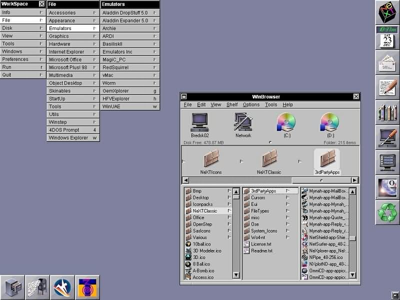
:max_bytes(150000):strip_icc():format(webp)/B1-Snipping-Tool-Windows11-46fbb894a6d04f289a0fdbf3f30c5c63.jpg)