Liquid Glass unifies Apple platform design language while providing a more dynamic and expressive user experience. Get to know the design...
Liquid Glass is a significant new step and evolution of the look and feel of Apple software. It introduces a flexible, dynamic layer to apps and system experiences across Apple’s ecosystem of products.
It builds on learnings from all the way from the Aqua user interface of Mac OS X, through to the realtime blurs of iOS 7, to the fluidity of iPhone X, the flexibility of the Dynamic Island, and the immersive interface of visionOS. Building off these learnings, rather than trying to simply recreate a material from the physical world, Liquid Glass is a new digital meta-material that dynamically bends and shapes light.
And simultaneously, it behaves and moves organically in a manner that feels more like a lightweight liquid, responding to both the fluidity of touch and the dynamism of modern apps.
I’m Chan and i’m a designer on Apple’s Human Interface design team. In this session, we’ll go over some of the core dynamic properties of Liquid Glass. Then, my colleague Shubham will discuss how Liquid Glass automatically adapts to different contexts and environments.
Lastly, Bruno will take us through some key principles on how to work with Liquid Glass. Let’s dive in.
Liquid glass complements the evolution of Apple product design, as screens have gotten more rounded and immersive.
It’s represented in the UI in rounded, floating forms that nest neatly in the rounded curves of modern devices. These clearly defined shapes feel easy to tap and are designed to relate to the natural geometry of our fingers so they feel friendly to touch interaction.
The primary way Liquid Glass visually defines itself is through something called Lensing.
Lensing occurs all around us in our experience of the natural world. Through this experience we’ve all gained an intuitive understanding of how the warping and bending of light of a transparent object communicates to us its presence, its motion, and form.
Liquid Glass uses these instinctive visual cues to provide separation and communicate layering in a new way while letting content shine through underneath it.
Where as previous materials scattered light, this new set of materials dynamically bends, shapes, and concentrates light in real time.
This provides definition against the background content while still feeling visually grounded in our experience of the natural world. By sculpting light like this, controls can feel ultra lightweight and transparent while still being visually distinguishable.
Instead of fading, Liquid Glass objects materialize in and out by gradually modulating the light bending and lensing, ensuring a graceful transition that preserves the optical integrity of the material.
How the material feels and behaves is just as important as the way it looks. From its foundation, both the visuals AND motion of LiquidGlass were designed as one. The motion of liquids is something we all have an intuitive feel for. Their smooth, responsive, and effortless motion and behavior are properties that interfaces can reference to move and react in a way that aligns with our innate grasp of the physical world.
To this effect, Liquid Glass responds to interaction by instantly flexing and energizing with light.
This makes the interface feel responsive, satisfying, and alive.
And it has an inherent gel-like flexibility to it that communicates its transient and malleable nature, as it moves in tandem with your interaction. This fluidity helps the interface feel aligned with the dynamism and continually changing nature of our thinking and movement.
Elements can even lift up into Liquid Glass temporarily, such as when you interact with a component. This lets the resting state stay visually quiet, while it comes to life on touch.
This works great for things like controls, where the transparent liquid lens can be seen through to precisely observe the value underneath it.
This sense of fluidity also extends not just to how the material reacts to your input, but also how it reacts to the dynamically changing environments of modern apps. As you go between states in an app, Liquid Glass dynamically morphs between thecontrols in each context. This maintains the concept of having a singular floating plane that the controls live on. And it makes transitions between different sections of an app feel fluid and seamless, as the controls continually shape shift. When showing a menu, the bubble simply pops open to reveal the content contained within.
This lightweight, in-line transition keeps everything right where you just tapped. And it communicates a very clear and direct relationship between the button and the content contained within.
With these properties, Liquid Glass ushers in a new era of how apps look. But it also changes how they feel, too.
With the ability to bend and shape light in new ways, fused with the ability to dynamically flex and shape shift, Liquid Glass is designed to make the experience of apps feel fundamentally more organic, more immersive, and more fluid.
Next, to dive into how Liquid Glass adapts automatically across different context and platforms, I’d like to hand it over to Shubham.
Thanks Chan. Liquid Glass is designed from the ground up to be adaptive to both its size and its environment. Its primary goal is to remain visually clear, deferring to the content underneath. But it's also constantly, subtly changing to ensure legibility and to maintain clear separation from the content layer.
Liquid Glass is composed of a number of layers that work together to give it its unique look. And unlike previous materials that had a fixed light or dark appearance, each layer continuously adapts based on what’s behind it.
As text scrolls underneath, shadows become more prominent to create additional separation.
The amount of tint and the dynamic range shift to always ensure buttons remain legible, while letting as much of the content through as possible.
And when needed, it can also independently switch between light and dark, allowing it to feel perfectly at home in any context… really letting your app's content shine.
When glass flexes and morphs to larger sizes – like when presenting a menu from a toolbar button – its material characteristics change to simulate a thicker, more substantial material. It casts deeper, richer shadows, has more pronounced lensing and refraction effects, and a softer scattering of light. These subtle changes enhance the perceived depth and aid in the legibility of the content within the glass element itself.
Liquid Glass is fundamental to creating a unified design language across all our platforms. On iPad and Mac, we've applied these very same principles.
Just like on iPhone, these Liquid Glass layers form a distinct functional layer for controls and navigation, floating above everything and giving you a larger, more expansive canvas for your content.
Glass controls nest perfectly into the rounded corners of windows, maintaining concentricity throughout the UI.
On larger elements, like sidebars, the appearance of Liquid Glass is informed by the ambient environment within the app.
Light from colorful content nearby can subtly spill onto its surface, reinforcing the material's context and its sense of elevation within the interface. And the effect isn't limited to the surface, the light reflects, scatters, and bleeds into the shadow as well – much like it would in the physical world.
Floating sidebars on iPad and Mac enable a whole new level of immersion.
The sidebar and tab bar, together, form a cohesive and consistent language for the core navigation of apps across all platforms. It can now be thought of as a single navigational element that fluidly scales as the canvas of the app grows.
Next, let’s talk about scroll edge effects.
Scroll edge effects work in concert with Liquid Glass to maintain that crucial separation between the UI and content layers and ensure legibility, especially with dynamically scrolling content.
Just like Liquid Glass, scroll edge effects are inherently adaptive. As content begins to scroll underneath a glass element, the effect gently dissolves the content into the background, lifting the glass visually above the moving content, and allowing floating elements like titles to always remain clear.
When darker content scrolls under, triggering the glass itself to transition to its dark style, the effect intelligently switches to apply a subtle dimming instead, again ensuring contrast and legibility. In some cases, like when there are pinned accessory views under a toolbar, such as column headers for example, we use a “hard style” effect instead.
Instead of a gradual fade, the effect is applied uniformly across the height of the toolbar and the pinned accessory view. You'll want to use this style when you need that extra degree of visual separation between floating elements in the accessory view and the scrolling content below. So that’s a look at how Liquid Glass adapts across sizes, environments, and platforms, and how you can leverage it alongside the scroll edge effects to ensure clarity and legibility, all while letting your app's content truly take center stage. Next I’d like to hand if off to Bruno to discuss Liquid Glass variants in more depth and guidelines on how to best use them in your apps. Thanks Shubham. To get the most out of Liquid Glass it is important to understand it at a deeper level. Lets go over how its built and some of its behaviors. That way you’ll know what to expect when you start designing with it.
The true magic of Liquid Glass lies in its holistic design. The light play, the depth effects, the adaptive changes, they aren't isolated features. They are layers inside a sophisticated system, working together to create a material that is greater than the sum of its parts. Let's look at some of these layers more closely. First, the highlights layer Liquid Glass lives inside an environment that behaves like the world around us. Light sources inside of this environment shine on the material producing highlights that respond to geometry just as you’d expect. On interactions, such as locking and unlocking your phone, these lights move in space, causing light to travel around the material, defining its silhouette. And in some cases, the lighting responds to device motion, making it feel like Liquid Glass is aware of its position in the real world Shadows also play an important role in helping elements feel grounded and defined. Pay close attention to the shadow in this next slide.
The element is aware of what’s behind it and increases the opacity of its shadow when it is over text. Conversely, it lowers the opacity of its shadow when it is over a solid light background.
This provides separation from the content to make sure elements are always easy to spot.
When you interact with Liquid Glass, the material illuminates from within as a form of feedback.
Starting right under your fingertips, the glow spreads throughout the element and onto any Liquid Glass elements nearby, interacting with the flexible properties of the material in a way that feels natural and fluid.
These behaviors make the interface feel alive and directly connected to the physical world and device input. There are times where multiple layers adapt together to maintain clarity and focus within the UI hierarchy.
For example, when a window loses focus on the Mac or iPad, Liquid Glass shifts its appearance and visually recedes to guide attention.
And this sophistication comes built-in. You get all these nuanced, dynamic behaviors automatically when applying Liquid Glass to your designs. Alright, now that i’ve gone over its structure and behaviors, I’ll talk about how and when to use Liquid Glass, as well as the different variants you can choose from. You may be tempted to use Liquid Glass everywhere but it is best reserved for the navigation layer that floats above the content of your app.
Consider this tableview: making it Liquid Glass would make it compete with other elements and muddy the hierarchy. So keep it in the content layer instead to ensure clarity Similarly, always avoid glass on glass Stacking Liquid Glass elements on top of each other can quickly make the interface feel cluttered and confusing.
When placing elements on top of Liquid Glass, avoid applying the material to both layers. Instead, use fills, transparency, and vibrancy for the top elements to make them feel like a thin overlay that is part of the material.
Next, let's talk about Liquid Glass variants. There are two to choose from: Regular and Clear. They should never be mixed, as they each have their own characteristics and specific use cases.
Regular is the most versatile and the one you will be using the most. This variant gives you all the visual and adaptive effects we’ve talked about, and provides legibility regardless of context. It works in any size, over any content and anything can be placed on top of it. Clear, on the other hand, does not have adaptive behaviors. It is permanently more transparent, which allows the richness of the content underneath to come through and interact with the glass in beautiful ways. To provide enough legibility for symbols or labels, it needs a dimming layer to darken the underlying content. Without it, legibility gets noticeably worse. If Liquid Glass elements in your app have a smaller footprint, you can use localized dimming and allow the content to retain more of its original vibrancy To recap, whereas the Regular variant can work anywhere, Clear should only be used when these 3 conditions are met.
First, the element you’re applying it to is over media-rich content. Second, your content layer won’t be negatively affected by introducing a dimming layer. And lastly, the content sitting above it is bold and bright. Now, I’ll talk about legibility: a central consideration that went into the design of Liquid Glass.
Small elements like navbars and tabbars, constantly adapt their appearance depending on what’s behind them. They also flip from light to dark based on the background to make sure the material looks as good as possible and is easily discernible.
Bigger elements, like menus or sidebars also adapt based on context, but they don’t flip from light to dark. Their surface area is too big and transitions like these would be distracting. To maintain legibility, symbols and glyphs on top of Liquid Glass, do the same. They flip from light to dark and vice versa, mirroring the glass’s behavior to maximize contrast. All content placed on the Regular variant will automatically receive this treatment. You can also use custom colors. But use them selectively. When items or elements serve a distinct functional purpose, you can tint them to bring attention to them. Lets take a closer look at how this works.
Liquid Glass introduces a new way of tinting elements that respects the principles of the material and maximizes legibility.
This technique is consistent across all Liquid Glass elements, from labels, text and fully tinted buttons… to the time on your lock screen. It brings life and vibrancy to the material and connects it more deeply to the content around it.
Selecting a color generates a range of tones that are mapped to content brightness underneath the tinted element. It draws inspiration from how colored glass works in reality: changing its hue, brightness and saturation depending on whats behind without deviating too much from the intended color.
Not only does this emphasize the physicality of the material, but it also helps legibility and contrast.
What’s great is that tinting is natively compatible with all the behaviors of glass. So, you can tint any element very easily.
Here is a button that is using a solid fill instead of the built-in tinting. As you can tell, it is completely opaque and breaks the visual character of Liquid Glass. But notice when it starts using the new tinting. All of a sudden it feels more transparent and more grounded in its environment.
Tinting should only be used to bring emphasis to primary elements and actions in the UI. First, lets look at an example of what not to do. Avoid tinting all your elements. When every element is tinted, nothing stands out, and it can be confusing. If you want to imbue color into your app, do it in the content layer instead. On the other hand, this View Bag button is a great example of when to use tinting, the red makes it stand out as the primary action in this food delivery app. The content layer is also key to avoiding any unwanted visual noise. In steady states, such as when an app first launches, avoid intersections between content and Liquid Glass. Instead, reposition or scale the content to maintain separation.
In addition to the these legibility considerations, there are also several accessibility features that Liquid Glass offers to suit all kinds of people and needs.
These act as modifiers on the material that change certain layers of Liquid Glass, without sacrificing its magic.
For instance, Reduced Transparency, makes Liquid Glass frostier and obscures more of the content behind it. Increased contrast, makes elements predominantly black or white and highlights them with a contrasting border and Reduced Motion decreases the intensity of some effects and disables any elastic properties for the material. These are available automatically whenever you use the new material. So whenever these settings are turned on at a system-level, Liquid Glass elements will get them across the board. Throughout this session we covered the core principles and values for Liquid Glass. We explored its functionality, behavior, and discussed practical guidelines to use it effectively and inclusively.
Liquid Glass delivers a unified design language across all platforms, seamlessly blending hardware and software. It introduces a more fluid and dynamic interaction experience than ever before, bringing a striking new look to every part of the interface. This is the start of a new chapter in Apple’s visual and interaction design, and we can't wait for you to be part of it.
Read the original article
Comments
We have 'instinctive visual cues' for depth and light coming from above, hence why button gradients are so immediately effective,because our visual system recognizes it in milliseconds. we don't have "instictive visual cues" for refraction and lensing , that's why we are confused about underwater distances . That's why magnifying glasses make us dizzy. I just can't believe this is coming from apple.
By whiteboardr 2025-06-1411:114 reply Plus, to be truly realistic it also would need to take into account ambient lighting scenarios surrounding the device displaying it.
Like this it’s really just another try in recreating glass which never made sense to be used in UI.
It is beyond me, how this got chosen as a way forward - taking visual design which makes sense in a VR/AR environment, to ruin their rectangular display UI.
It will make implementation way more complex than it is already and worse it will set off an avalanche of badly done imitations creating a mess throughout all touchpoints across companies taking years to clean up again - just as I thought that UI design finally reached an acceptable level of maturity.
Sad, really sad for a company like Apple to throw out precision, clarity and contrast for “effect”.
Sad.
It's not actually glass, instead the apple engineers and designers are basically simulating effect of surface tension of drops of liquid. Unfortunately the refraction at the edges of a droplet is not informative about whether the droplet is inward or outward facing (i.e. if it it toggled on or off). Hence why they use additional highlights and shadow to indicate the 3D structure. The liquid effect is a total gimmick . And they added insult to injury by adding color-changes and movement which is totally distracting when you re scrolling that diffucult paper.
I know most people couldn’t care less about this, but those gimmicky animations probably consume more computing power than the entire Apollo project, which strikes me as unnecessary and wasteful. Given the choice, I’d much rather have a clean, efficient interface.
I tend to like Material Design in comparison. It’s clean, efficient, and usable. I just hope Google won’t try to "improve" it with annoying gimmicks and end up making things worse, like Apple did here.
"Flat" design is equally offensive by not demarcating controls as controls, or their state in an intuitive way.
Just as we were finally seeing UI step away from that BS, Apple jumps all the way back into much-scorned, cheesily-excessive skeuomorphism... adding a raft of failed ideas from 20 years ago.
Since this is in contrast to "wildly not flat and full of visual gimmicks": the modern "flat" style has severe (and very stupid) issues, yea. But "flat" has been around for a very long time in touch UI with clear control boundaries - just draw a box around it, maybe give it a background color.
By DidYaWipe 2025-06-1418:22 That's better than plain text that just happens to be a hidden control, but text with a background color might just be... text with a background color, for emphasis. Or it's text with a background color, to distinguish it from editable text. A background color does not tell the user that it's a control.
A box around it? Slightly better, but still doesn't convey state. Sure, you can fill it in when it's "on," but that's still guesswork on the part of the user if he arrives to find it filled in already.
By egypturnash 2025-06-1422:21 I'm pretty sure my Amiga 1000 had more computing power than the entire Apollo project. I mostly used it for games.
By QuantumGood 2025-06-1416:271 reply Historically, design as a priority worsened UI for average and new users, and Apple has prioritized a feeling of elegance over ease of use.
Liquid glass puts UI second (feature cues) in favor of UX (interesting experience), harkening back to skeuomorphism but misprioritizing UI. I appreciated in Jobs's time how skeuomorphism was used to reveal more features, and give new users simple cues.
Now there is this idea that there is a higher percentage of advanced users, but since now there are MORE users (anyone with a screen), and continual change, I think there is still a large percentage of less advanced users "harmed" by prioritizing UX over UI.
By QuantumGood 2025-06-1421:57 It's also ironic that so much effort has been spent on the "liquid" feel of the phone ... which is mostly lost when it's in a case.
By philistine 2025-06-1412:201 reply I think they refuse to pick a shade of grey for their UI's background, so we're stuck with transparent elements.
You know the dominant apps used on phones have large full screen user-generated video and imagery, right?
These are UI elements designed to work great over scrolling content feeds, full screen product images, album artwork, and thirty second videos of people doing meme dances. There is no room for ‘a gray background’.
By whiteboardr 2025-06-1417:161 reply This doesn’t justify applying a less than suboptimal design for everything else.
UI on content is a special case just like AR and here it might be ok, but why add “glass” as a background on icons or panels for text that are served much better by using a single colored transparent background without the noise that glass is bringing to the table - if there’s a background needed at all.
The visual signal to noise ratio is being cranked up to 11 for novelty’s sake.
I think you’re watching a way different video about this than me.
In the design guidance they’re explicitly saying liquid glass is for selective elements in the navigation layer. When those elements pop up modals those use a very subdued and opaque glass that loses the adaptive contrast, but still physically embeds them in that same floating navigation layer.
They’re not saying everything needs to be made of glass. They’re explicitly saying don’t make everything from glass.
By whiteboardr 2025-06-1417:35 For highlighting text?
By xnx 2025-06-1419:16 > These are UI elements designed to work great over scrolling content feeds, full screen product images, album artwork, and thirty second videos of people doing meme dances
Liquid glass also seems terrible for this type of application. TikTok's overlays are much less intrusive and distracting.
Now give the laptop back to your parents and go touch grass.
This has no place in the desktop.
By jameshart 2025-06-1513:24 What a patronizing and shallow response.
the liquid glass ends up being vital for windows in AR. the vision pro has this, and it really helps you see behind the windows you've placed. while a shit experience on a phone, i do think liquid glass is a useful choice in the AR world
By wpm 2025-06-1415:15 Back in my day (as far back as a month ago), we just called that effect “transparency” or “translucency”. Hell, there are types of AppKit popup windows that have the effect on by default, that have existed untouched since the early days of Mac OS X. Don’t give Apple more credit than they deserve here.
By whiteboardr 2025-06-1413:011 reply No question about that - see above.
What works for augmented UI doesn’t in a desktop, mobile or 10ft experience.
It’s a terrible mistake porting something to an environment where transparency isn’t helping but brings about the opposite effect.
By tyiz 2025-06-1415:46 [dead]
By serial_dev 2025-06-145:463 reply That’s an interesting point, never thought about it.
These complicated lenses distorting light from all directions look fancy in a designer portfolio, having them almost everywhere… I’m not sure how it will work out.
In contrast, the original material design was quite intuitive, iirc they based their design on paper sheets, much simpler, and much more common in our day to day life.
I still have some hope it will work out great, if Apple can take the accessibility visibility issues seriously, and developers using it in moderation, it can be great.
By intrasight 2025-06-1411:002 reply I see no way around all that optics physics not sucking up computation and battery. Perhaps Apple will add liquid glass silicon to the mix to do that physics in hardware. Using glass to compute glass, LOL
By LoganDark 2025-06-1412:28 Liquid glass can't possibly be that much more expensive than vibrancy (if it even is). The refraction effects are effectively just a displacement map (probably calculated realtime, but still).
my initial thought is that apple is preparing to launch physically deforming screens which will create bumps similar to this liquid.
Or using cameras to render what’s behind the phone as a background. That would help explain the continued focus on thinness.
By DidYaWipe 2025-06-1417:35 The continued focus on thinness betrays a lack of useful ideas... a hallmark of the Jony Ive school of enshittification.
I remember finding this super cool when it first came out: https://www.youtube.com/watch?v=JelhR2iPuw0
I'm not sure I'd want that on my daily devices, however I would like this on my car heads-up unit where tactile feedback with actual buttons is preferred to keep the eyes on the road. At least that would be better than nothing.
By LoganDark 2025-06-1414:01 I wouldn't want it on my daily devices either, but mainly because I prefer my touchscreens to be perfectly flat and durable glass.
By intrasight 2025-06-1419:32 Physically tactile would change my opinion about Liquid Glass. And it would make screens more usable for the visually impaired.
By ManuelKiessling 2025-06-1420:14 Unless you want the same look on your non-tactile and tactile surfaces.
But I think the theory is too far-fetched.
By DidYaWipe 2025-06-1417:33 Paper sheets do not have controls on them. That's why "Material Design" sucks too, as all does the rest of the "flat" design fad.
Minimal visual cues, analogous (not photo-faithful) to real-world physical objects made GUIs a revolutionary advance in computer use. Both flat design and this new Apple junk (which, let's face it, is a return to hated and nonsensical skeuomorphism) ignore the very concepts that made GUIs so usable.
By jameshart 2025-06-1416:51 The linked video gives the explicit human interface guideline of don’t use it everywhere.
By bigstrat2003 2025-06-1418:151 reply > I just can't believe this is coming from apple.
Apple has prioritized style over usability for decades now. Remember the godawful hockey puck mouse and how stubbornly they clung to it? It shouldn't be a surprise when Apple picks a solution that looks cool but is worse to use; that's who they are.
By osigurdson 2025-06-1418:321 reply I agree that their keyboards and mice are the worst. Even the cheapest no-name peripherals do not invoke the same kind of anxiety that Apple's stuff does. I don't have any issue with their UIs however. I think they are generally very good. Things are not perhaps as discoverable as they could be but the alternative would probably be worse as it would lead to more clutter.
By robinsonb5 2025-06-1420:31 > I agree that their keyboards and mice are the worst.
They are now. A couple of weeks ago I bought an Apple keyboard from the late 80s on EBay (M0116 model). After a quick solder job wiring half an S-Video cable to a ProMicro, it now talks USB, works perfectly and is one of the best feeling keyboards you could hope to use. (One of the later iterations with saner cursor key placement would be better still, though...)
By naikrovek 2025-06-1413:44 Holding Apple to a high standard this long after the the death of the industry’s one and only true UI/UX purist is folly.
It’s regular “you”s and “me”s there now.
US corporate structure absolutely kills the spirit in the kind of people who could make a difference. And when it doesn’t, it kills the ability of those people to be promoted to a position of influence.
I am not a huge fan of Steve Jobs, but he did understand UI and UX better than just about anyone, and he stuck to his guns.
“I can’t believe this is coming from Apple” is something I said when I saw iPhones with a camera bump. Camera bumps are a fucking abomination.
The accessibility angle is what concerns me. The demos of the Music app, for example, seemed much less clear. You’re gonna have to mess around with whatever settings they provide to turn it off if you have impaired visibility.
It gives off a weird 2.5D HUD effect that works well enough in first-person games (which is basically simulating AR), but is just harder to read and kind of unmoored from the main UX on a flat screen.
By christophilus 2025-06-1416:52 Their accessibility settings actually seem decent. You can turn off the animation, increase contrast, go nearly opaque… I still don’t think I’ll love this new paradigm, but it looks like I can mostly mitigate my concerns.
By jameshart 2025-06-1416:48 End of the linked video highlights the accessibility settings.
By wapeoifjaweofji 2025-06-1421:531 reply Apple is the company that makes laptops without power LEDs so you can't even tell if they're on.
By callc 2025-06-1422:12 “Think different”
Joking aside, “design” clearly supplanting ease of use
By foobarian 2025-06-1417:47 I have a feeling it's a bit of cart driving the horse. Look at all this GFX power we have, how could we harness it for UI instead of boring old compositing and alpha?
At the same time remember how much of a struggle it was in the 90s to show transparent layers? Good times
How is this wrong?
Our visual system is optimized, rather extremely, for understanding 3d scenes under the simple perspective model that our eyes are based on: x' = (x * f) / z
Outside of that 99.999% experience norm, that are brains are so used to, is disconnect and discomfort. If you've ever put on a new pair of glasses, with a different prescription, you'll understand exactly what he's talking about: depth offset and dizziness.
The disconnect is why refraction and lensing is interesting to look at: the model your eyes are used to seeing, for the world behind the thing, is not normal.
I wonder if this is linked to the reason that so many people become nauseous with 3D glasses.
When we see 3d movements that don't correlate with what our inner ears, the response is that our body assumes something is wrong, we have ingested a toxin, and a nausea / vomit response is created.
There is something visually jarring about this Liquid Glass UI, and it's possible it's related to movements not correlating with an internal frame of reference.
By aquariusDue 2025-06-149:01 I get car sick quite easily, same with VR, but I actually like the design language of Liquid Glass over the first iteration of Material (I like the new updates to Material too). I think people should watch from minute 13 onward if they're short on time and want the gist of it.
I guess I'm a weird outlier and that's fine.
By LoganDark 2025-06-1415:18 I can't use 3d glasses because my eyes don't converge properly. Maybe one day I'll have surgery to correct that
the fact that it's surprising does not make it a visual cue. A cue to what? I am not aware of any psychophysics study that says we have perception of droplets or lens transformations (in contrast to shadows , gradients etc that are well studied). There also doesn't seem to be an evolutionary reason for it because the natural world does not have lenses and glass. And UIs are usually based on intuitive features.
Not saying this makes the ui good but it should go without saying that the natural world has water which acts as a lens.
Also, of course we have perception of droplets. What we don’t have is an intuitive understanding of how light interacts with droplets.
I suspect that Apple are trying to leverage this lack of intuition to make their ui interesting to look at in an evergreen way. New backgrounds mean new interesting interactions. I’m not confident that they’ve succeeded or that that’s actually a good goal to have though. I have it on my iPhone 13 and personally I find it annoying to parse, and I feel relief when I go back to traditional apps untouched by the update like Google Maps
droplets of water are not lenses without a glass behind it, and we couldn't see substantial effects behind them before we had glass windows. There was little evolutionary reason to develop any perception of refraction in droplets of water. in contrast, shadows are instant indicators of distance and gradients instantly distinguish concave from convex surfaces for light coming from above.
(water doesnt do lensing unless it s a droplet)
By oharapj 2025-06-1414:08 I get that your point is that we don’t have a strong intuition for lenses and that’s tied to a lack of evolutionary reason to have them. I agree and suspect that might be the point of why Apple are using a the lens effects. We don’t need to go so far as to say the natural world is completely devoid of such phenomena. Of course they’re there but they’re largely not relevant to survival throughout human history
Is there any study saying that user interfaces should use visual effects for which our brains have hardware acceleration? It seems a reasonable premise, but is there data?
Taking advantage of innate perceptual cues is smart and our interfaces have always taken advantages of them https://en.wikipedia.org/wiki/Depth_perception
we shouldn't need a manual to interpret a UI
I don’t entirely disagree, but that is still an intuition, not a proof that our interfaces should always work that way.
We used to ride animals with legs, which worked a lot like our legs do. Does that mean the wheel is wrong? We don’t have wheels, and they don’t occur in nature.
I don’t think Apple has invented the wheel, and I’m inclined to agree that leveraging our hardware acceleration makes sense. But I haven’t seen anything beyond blind assertion that of course it has to work that way.
By nomel 2025-06-1718:02 I think things are more "differential" than that. Since many of us look at these interfaces more than any other visual stimulus, our perception will be optimized around them. The ideal system, in the short term, will involve familiarity more than anything.
By nomel 2025-06-1619:54 I assume he's saying the "disconnect" is easy to see.
If our brain understands one thing, it's that glass is a wall between our body and what we see. You can't touch that, or you'll hurt yourself.
By jameshart 2025-06-1416:36 The sample interfaces and usecases seem highly legible and match my instinctive visual understanding for transparent materials. They look attractive and well separated from their surroundings. Not sure what this objection is coming from - have you looked at the results?
By jameslk 2025-06-1418:58 > we don't have "instictive visual cues" for refraction and lensing
Do you have anything to back this up? Seems a lot of your argument is hinging on this point. I’m skeptical that 1. this is true, and 2. Apple wouldn’t have considered it if it were true
By DidYaWipe 2025-06-1417:19 Nailed it.
Apple's vaunted UI has always been crippled by some stupid decisions and practices. But exhuming the idiotic "transparent" UI fad that died 20 years ago must rank among the worst.
What Apple just rolled out is embarrassing and depressing. You know it's bad when a thread like this is full of well-written, incontrovertible takedowns and nearly devoid of apologist drivel.
By kylebenzle 2025-06-1414:071 reply [flagged]
By rob_c 2025-06-1511:13 I've never wanted Ashai to be more of a success. Their hardware is nice, but the desktop and window management sucks the big one.
I think I'm convinced with liquid glass design, the issues highlighted by the users in the beta release IMHO are a result of rushing it out for WWDC. It appears that they didn't have enough time to polish the UI to comply with the principles described in this video.
For example the designer in this video says no glass over glass but the control center and the lock screen are glass over glass. It looks cluttered and the legibility is horrible, as predicted by the designers here.
They probably just compiled the old UI with the new liquid glass framework without going through the design considerations that are required by the new system.
By the time of the release, it will look great if Apple doesn't shy away from letting their developers re-work everything.
What I wonder now is, why hadn't that happen already? Don't the internal developers have access to the new design and the people behind it until the last moment? If the designers of Liquid Glass and the designers of the locks screen and the control center have talked, they would have known the principles described in the WWDC video and avoid all that.
This is not surprising at all.
I was a student taking an android dev course when the first iteration of material design came out. My classmates and I had the running joke of “this is an amazing design guide, someone should send it to google”.
You’d see even the most specific principles being broken, the left menu in gmail for example interacted with the header exactly the opposite way the guide said it should.
By deepsun 2025-06-153:14 Pros know all the rules, masters know when to break them.
By chartered_stack 2025-06-148:302 reply The main issue I feel is that Apple's internal threshold for what quality of software is acceptable to be launched to the public has dropped a lot in the years since the last major redesign.
Yes, they iterate through versions and drop things that don't work with their design philosophy (parallax effects on iOS 7) but the first major version they released always seemed well thought out and solid from a design perspective.
I don't get that feeling from this redesign. I'm sure that this Liquid Glass redesign would look and work great next year or the year after that or even by the public launch of iOS 26. They'll fix the issues with readability, control center etc. But the fact that the first version of Liquid Glass doesn't look good is what's problematic.
By madeofpalk 2025-06-148:381 reply iOS 7's first beta design was worse than this. They walked back some pretty distinctive parts of the design - mainly the ultra thin fonts - during the betas and following releases.
By jeffgreco 2025-06-1418:21 Agree to disagree I guess - iOS 7’s initial preview wasn’t perfect but not incoherent and illegible to this degree.
If anyone wants to refresh their memory: https://youtu.be/6jBK3Dggkwg
Not to mention way more functionality added to the OS that year than this.
This hasn’t been “launched to the public”. It’s a developer beta so that developers can start working on testing and updating their apps for the new OS.
By chartered_stack 2025-06-1418:01 You're right that this isn't "launched to the public" and is just a developer beta. However, I meant it in a more "outside of Apple" kind of way. I guess that should have been clearer.
Everyone at Apple knows WWDC is in June, and WWDC is the event where Apple show off the new stuff and deliver a public beta. Some of the terrible designs were shown in the pre-recorded demos, and if anyone had used the new beta for more than five minutes, they would have ended up in the broken control center.
By Kwpolska 2025-06-1410:35 It’s also the biggest software event in the Apple world. The implementation may improve, but the pre-recorded demo videos show off the bad parts pretty clearly, almost as if the terrible readability is intentional.
By Spivak 2025-06-1414:32 And not even a public beta, a developer only beta.
By throwaway290 2025-06-148:142 reply If you're right, maybe the reason they rushed it is because people accuse Apple of copying others if they take time to do something right
However, it is also true that Apple's QA gets bad lately. They let features creep but lose attention to detail so there are more small glitches recently. Along with just bad design, like surely the old Apple would not allow mouse cursor to be "lost" in the notch on the new MBPs. Maybe it's the trend. They become less and less about getting it right and more about getting it out and then reacting when users complain.
By flohofwoe 2025-06-149:41 > because people accuse Apple of copying others if they take time to do something right
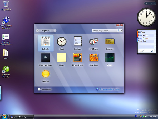
Windows Vista had a translucent UI nearly two decades ago, that should be enough time for Apple to figure out if it's a good or bad idea to copy ;)
There's also plenty of computer games which experiment with translucency in their UIs.
If the Apple UI designers would look out of their ivory tower from time to time they could have realized that translucent UIs are an exceptionally stupid idea after the very shortlived "oooooh fancy shaders" novelty effect is over.
Tbh, I get strong flat-earther vibes from that video ;) E.g. trying to justify a stupid base assumptiom with pseudo-science.
I predict that in 2..5 years Apple will go back to regular opaque UI elements with a slight 3D hint to separate items that can be interacted with from non-interactive items.
Windows users might be lucky when Microsoft skips that fashion cycle by saying "been there, done that".
By cosmic_cheese 2025-06-1413:50 > Windows users might be lucky when Microsoft skips that fashion cycle by saying "been there, done that".
Given Microsoft’s track record, I’d expect worse, not better. Metro might’ve looked good on phones, but the desktop incarnation was pretty ugly (it was basically Windows 1.0 with antialiasing) compared to Aero. It would be completely on brand for them to do something like ditch their current reasonably nice looking Fluent in favor of something hideous and then stubbornly try to make it work without changes for the next decade before finally relenting.
I think I know what happened.
The A-squad design team left Apple 15 years ago.
The B-squad left 5 years ago.
What remains is a sea of Gen Z designers who weren't yet alive when the foggy glass of Windows Vista seemed like a good idea.
Meanwhile, the talent wars are raging, with every AI company offering 7-figure salaries to the best of Apple's prodigies.
Apple is now the old guard. They're no longer cool, and as a public company, cost controls are too stringent; they can't pay as much. What is Apple to do?
They can give the designers a sense of ownership. It's not a question of how (un)qualified the team is; it's a retention play.
Is the design good? The A and B squads would say no. But this is the best Apple can do these days to keep critical talent engaged.
They'll burn a cycle re-learning fundamental lessons in accessibility, retain talent, and cling to the hope that next year they'll have a midwit Siri than can book a flight with a decent looking UI.
Alan Dye is the interface design lead at Apple, he's been there since 2006.
One of the lead designers on Liquid Glass is Chan Karunamuni, who's been at Apple since the early 2010s. If you search for more of the names of the design presenters at this WWDC, you'll find a lot of people with similarly long tenure.
So the theory that it's all Gen Z designers with no experience or talent seems pretty weak.
By aquariusDue 2025-06-148:471 reply Yeah, sure. But it's more fun to talk in hypotheticals and point fingers at straw people and those young kids that make a fetish of old Nokia phones and dumb tech.
So I'm sure there's 3 Gen Z folks in a trench coat approving the work of those other Gen Z designers.
All this is just delegating to flavor of the domain "higher powers" instead of trying to grapple with the complexity of reality.
We just have to wait for Gen Alpha to bring back flat design 10 or so years from today.
By willis936 2025-06-149:12 And to think this is the same field that has an issue with ageism as indicated by this post yesterday. I take serious issue with people over 40 being protected while discrimination against young people "just doesn't exist". It's a clear case of the law being constructed to advantage the already advantaged. It's politically expedient because old people have wealth and influence and young people don't. Could you hire someone who can't demonstrate competence in an interview to do the job? Why does it matter if they're 20 or 100? Yet the two cases are treated very differently. You can say you won't hire a 20 year old because they don't know what they're doing, but can you not hire the 100 year old because their mental faculties have deteriorated?
https://news.ycombinator.com/item?id=44269225
Edit: this appears to be a hot take, so I challenge others to take a step back and consider other protected classes and anti-discrimination laws. They don't call out one race or sex, they say they're all protected and the very act of discriminating is not allowed during hiring. They don't say "you can't discriminate against white people or men but others are fine". That's what the ADEA does.
Especially at Apple where it’s very well known that ultimate decision making is centralised around very few, very senior people.
By FirmwareBurner 2025-06-1411:572 reply A lot of "old and senior people" also fumble with big mistakes a lot of the time. They're not all-perfect gods. In reality, most successful people are one trick ponies. They caught lightning in a bottle once early on that boosted their careers but that doesn't mean they're still relevant and correct with their decision making today.
Look at John Romero, he knocked it out of the park with Doom 1, 2 and some of Quake, but all his projects after have been flops of catastrophic proportions. Look at Jonny Ive's last design mistakes at Apple compared to the early successes that were perfection from all aspects.
Most people can't pull success after success forever, they always bottom out at some point then decline, some sooner than others, especially in a fast changing field like tech. So it's a high chance those senior higher ups at Apple are now dated and out of touch, but still have the high egos and influence from the bygone era. Happens at virtually 100% of the companies.
> They're not all-perfect gods. In reality, most successful people are one trick ponies. They caught lightning in a bottle once early on that boosted their careers but that doesn't mean they're still relevant and correct with their decision making today.
I don't think that characterization is quite right either. I'm a big fan of Brian Eno's "scenius" phrasing:
> A few years ago I came up with a new word. I was fed up with the old art-history idea of genius - the notion that gifted individuals turn up out of nowhere and light the way for all the rest of us dummies to follow. I became (and still am) more and more convinced that the important changes in cultural history were actually the product of very large numbers of people and circumstances conspiring to make something new. I call this ‘scenius’ - it means ‘the intelligence and intuition of a whole cultural scene’.
Extremely successful people benefit from the scenius within which they get to operate. But as that context changes and evolves over time, they fail to recreate their earlier wild successes - not because they lost any of their skills (although that can also happen), but because the skills aren't sufficient, and the deep, layered conditions that enabled those wild successes just aren't there anymore.
By kristianc 2025-06-1414:13 I think there is something in that. Certainly the world of work does seem to pivot between rewarding people that “do the work” and those that “do the work around the work” but separate themselves from actual execution. 2021-2 was peak middle manager froth, and were on a swing toward more operator led now. Usually middle management “present the work upwards” types dominate though.
By lttlrck 2025-06-1413:22 That a great idea, perhaps it is not just cultural.
Look at the Solvay Conference. That's a lot of lightning in a bottle all at once.
Though it's beyond me to articulate it, perhaps that was also cultural.
By bigyabai 2025-06-1413:31 I could believe that this happens at Apple if it wasn't for the executive veto that pushed stuff like the Touch Bar and Butterfly Keyboard to consumers. It sounds less like "very large numbers of people" conspiring, and more like a select few conspirators hand-picking the contributions they think would sell well.
By bigstrat2003 2025-06-1418:19 > Look at John Romero, he knocked it out of the park with Doom 1, 2 and some of Quake, but all his projects after have been flops of catastrophic proportions.
And the other guys from id haven't exactly recaptured the same magic either. It's a shame they broke up, it turns out that the team was way stronger together than any of them has been on their own.
By trippsydrippsy 2025-06-149:35 [dead]
I like to observe how organization affects how a company operates. As soon as you create a department, that department will start to generate reasons why it should remain being a department, as a sort of self preservation instinct. If you establish a design department, they will start planning complete redesigns sooner or later -- they need to have something going on to justify their existence. When I see this type of redesign, I can't help but wonder whether it is something that was cooked so that the design department can have a place at the table.
As a tangent, HR departments are very often affected by this as well. As soon as you have large enough HR, they will start generating ideas about how to waste other teams time. They have to justify their existence by organizing some events, trainings, activities, even if they actively harm the bottom line.
By teddyh 2025-06-1410:50 “Pournelle's Iron Law of Bureaucracy states that in any bureaucratic organization there will be two kinds of people:
First, there will be those who are devoted to the goals of the organization. Examples are dedicated classroom teachers in an educational bureaucracy, many of the engineers and launch technicians and scientists at NASA, even some agricultural scientists and advisors in the former Soviet Union collective farming administration.
Secondly, there will be those dedicated to the organization itself. Examples are many of the administrators in the education system, many professors of education, many teachers union officials, much of the NASA headquarters staff, etc.
The Iron Law states that in every case the second group will gain and keep control of the organization. It will write the rules, and control promotions within the organization.”
I see this daily in our banking megacorp. We have IT security team(s), which permeates all other IT activities like ink on paper. On its own its a good approach obviously, we weren't for example hacked or scammed in any high profile case, ever.
But there is no limit to how much additional security you can bring, so they do bring all of it. Recently had to get new Tomcat distribution deployed via Chef tool, of course our own package of it. Now it runs under 2 unix users, each owns various parts of Tomcat. Main startup config (options.sh) is owned by root, to which we will never ever get access, one has to do all changes in a complex approval and build process via Chef. Servers disconnect you after 2-3 mins of inactivity, if you deal with a small cluster you need literally ie 16 putty sessions open which constantly try to logout. And similar stuff everywhere, in all apps, laptops, network etc.
All this means that previously simple debugging now becomes a small circus and fight with ecosystem. Deliveries take longer, everything takes longer. Nobody relevant dares to speak up (or even understands the situation), to not be branded a fool who doesn't want the most security for the bank.
I would be mad if this would be my company, but I go there to collect paychecks and sponsor actual life for me and my family so can handle this. For now at least.
By signal11 2025-06-1410:29 Conway’s Law is a bear.
Alternative approach, also from a financial services world: VMs are created with a DSL on top of qemu/firecracker, containers with Dockerfiles. Cyber are part of an image review group alongside other engineers that validates the base images.
But: no interactive access to any of these VMs at all. There’s hypervisors running on bare metal, but SRE teams have that scripted pretty well to the point a physical server can be added in a day or so. It does mean you’ve to be serious about logging, monitoring and health.
This is one instance where we got it right (I think). We do have some legacy servers we’re trying to get rid of. But we’ve learnt we can run even complex vendor apps this way.
Conway’s Law comes to bite us in other ways though! Like I said, it’s a bear.
Agreed. But what is the alternative? No departments at all? Everybody belonging to one giant single team?
In large companies, each project is approved at each stage by a steering committee. And then as appropriate more senior committes, senior leaders and eventually the CEO and the board.
The poster above is right in that if you create a design team they will want to justify their existence but it's the controls above and around it that is responsible for keeping them in check.
By drw85 2025-06-148:24 In my experience that then leads to the politics game.
People will cling to those senior leaders and make themselves visible and important to be kept around and be validated and enabled.
By HellDunkel 2025-06-148:571 reply This view is very „hackernewsy“ and reveals a lot more about the mindset around here than the what is going on with apple. Firstly i don‘t think there is much fluctuation with the apple design team except when Ive left but i guess that was mainly due to the ceo change.
I remember a time when microsoft came around the corner with flat design on their phones and the iphone all of a sudden looked outdated. They adopted a flat look shortly after. They did that pretty well.
Thirdly and most important: noone does gaussian blurs, macro and micro transitions better than apple and it‘s a key part of their success. They are taking it one step further now. Even if it doesn‘t improve the experience for users it could help distinguish themselves visually. And there is nothing wrong with that.
By hackyhacky 2025-06-1414:141 reply > Even if it doesn‘t improve the experience for users it could help distinguish themselves visually. And there is nothing wrong with that.
I think a lot of folks here would say that there is something wrong with degrading the user experience to achieve a win for branding.
By user____name 2025-06-1415:22 I think the above comment is implying that the glass effects are more or less neutral, not degrading.
Aero Glass in Windows Vista and 7 worked quite well. Virtually no applications had the glass everywhere. Many stayed with the default of only having a glass title bar and window border. Some apps extended it a little to cover a toolbar or two. Also, the glass effect was simpler, and had enough contrast by default (and the colour and transparency were customizable), whereas Apple has the glass everywhere and often with unreadable text.
By jeroenhd 2025-06-1417:09 In some Vista betas, where Aero wasn't finished yet, Aero's glass was a lot more transparent. This video shows some of it: https://www.youtube.com/watch?v=qCDcekzU3cQ
There were parts of Vista that were mostly glass and they still looked fine. The widget picker comes to mind: https://istartedsomething.com/wp-content/uploads/2006/09/gad...
What Apple demonstrated in their first OS demo is not yet finished, and I'm sure they'll add some more frosted glass efects for legibility and such. What they show off in the video looks fine to me, and the explanation that comes with the visuals show that at least from a designer point of view, all of the weird stuff that jumps out in the macOS demo was violating the design principles.
I loved Aero and I bet once Apple adds the diffuse glass to the places it need to for legibility, I'm sure this will look great too.
By martin-adams 2025-06-148:251 reply Siri to book a flight? I just want it to reliably tell me what time a specific meeting is tomorrow, know that when I ask for where Mount Etna is, I don’t mean a city in the USA, and stop just ignoring me randomly when I talk to it.
Apple are much further behind with Siri than they realise.
By latexr 2025-06-148:49 > Apple are much further behind with Siri than they realise.
I think Apple realises it way better than you’re giving them credit for. They simply weren’t able to do anything about it yet, even though they’re clearly trying.
It seems like they are trying to unify the UX for vision OS and other devices and have them finally morph with the AR interfaces that are to come. There is probably a bigger vision behind this than just shiny visuals.
By calmbell 2025-06-1410:10 They have been doing this slowly over the past several years. I decided to move from macOS to Linux the day settings turned into a scrolling iOS-style list rather than an actual settings menu.
By djfivyvusn 2025-06-147:541 reply My computer company would never do such a thing.
Im not an Apple fan boy but Apple has been at the forefront of alot of design decisions that other companies later follow. So whilst I don’t agree with the liquid design. I suspect there’s more to it than meets the eye.
By intrasight 2025-06-1410:52 I get the impression that most (myself included) think there is nothing more than meets the eye - which is why some say that Steve Jobs is rolling in his grave.
By jeroenhd 2025-06-1417:11 I think this too. Microsoft thought something similar when they tried to unify Windows, Xbox, Windows Phone, and Windows RT in one design language.
With how badly Apple's VR headset actually sold, I don't think they're going to for a unified AR-first approach just yet. Then again, Apple did think their VR headset was a good idea, so maybe they're just high on their own supply.
By okdood64 2025-06-1415:57 Low quality comment that is provably untrue based on the team's leadership.
Can we stop blaming Gen Z for everything? This happens with every generation.
By v5v3 2025-06-147:38 "... and as a public company, cost controls are too stringent;"
Is that because a public company or because Tim Cook is a bottom line finance guy?
"they can't pay as much."
Why not? Thought apple had enormous cash reserves.
By throw0101c 2025-06-1412:472 reply > The A-squad design team left Apple 15 years ago.
Does the A-squad include Steve Jobs, who seemed to have been a fan of skeuomorphism:
* https://en.wikipedia.org/wiki/Skeuomorph#Virtual_examples
Does the A-squad include Johnny Ive, who gave us butterfly keyboards and the Touch Bar (where (IIRC) the initial revision of which did not have a separate physical key for ESC)? Though Ive did get rid of skeuomorphism.
By simondotau 2025-06-1413:442 reply > Though Ive did get rid of skeuomorphism.
By replacing skeuomorphism with minimalism, Ive's anti-skeu was a cure nearly as worse as the disease. They were right to move away from skeuomorphism, but they did so recklessly, giving us a UX where almost all cues for an element being "clickable" were stripped away.
Ive hasn't done a single impressive thing after Jobs' departure. To the extent that Ive did anything noteworthy, it was with Jobs as visionary, product director and tastemaker. Outside of that relationship, his work has been derivative of prior Apple design success, or embarrassingly wrong-footed. Factoring in the lag time of product cycles, it's astonishing how rapidly Apple improved after Ive's departure.
I've been in agreement with you up until this point -
> it's astonishing how rapidly Apple improved after Ive's departure
Is there another Apple? What improvements are you talking about, leave alone astonishing ones?
By matwood 2025-06-1415:08 The MBP went from few ports and thinner at all costs, back towards functionality.
By mixmastamyk 2025-06-1417:01 Keyboard and touch bar reverted.
Not exactly improvements in the traditional sense. More likely cleaning up an intentional mess.
By JKCalhoun 2025-06-1421:43 I guess I agree.
Perhaps people can argue with me: I claim skeuomorphism jumped the shark with the pseudo reel-to-reel playback UI in ... was it the Podcasts app? Or maybe people think it was Notes with the torn edge along the top margin.
Regardless, skeuomorphism seems to have gone too far at some point. Perhaps became overly cute, overly precious, pretty-pretty.
Skeuomorphism was said to have been the thing in early GUI computers, as metaphor or real objects, that helped early users to those interfaces understand them. Dragging a file icon that looked like a dog-eared piece of paper to a trash can icon on the screen (to delete the file) — the most obvious example.
I suspect by the time the Web came around, users had to become more comfortable with being bombarded with all manner of wild UI paradigms and they learned to more or less cope. Skeuomorphism, like training wheels, were perhaps not really needed as much as they had been a decade earlier.
By GuB-42 2025-06-1414:35 What's wrong with skeuomorphism? It is wrong if it is done wrong, like everything, but done right, it looks good and feels familiar. It is pretty much the standard in music production software and people don't seem to complain about it.
By ivape 2025-06-149:35 Liquid Glass looks really good, so not sure what you're talking about their A team being gone. All these other companies wish they had Apple's design team.
By wpm 2025-06-1415:30 I think more accurately, Apple’s, while imperfect, A-tier editor passed away in 2011, and no one replaced him.
It has been a downward slope since then after the momentum dissipated after his death.
Turns out, I didn’t like the operating system Apple made. I liked the OS Apple made while being curated and directed by Steve Jobs. His taste matched mine in a lot of important ways.
I have no tastes in common with Alan Dye.
By conradfr 2025-06-149:28 That sounds more like a false good idea that should have been stopped at some point.
When I read "liquid glass" and saw a thumbnail of it I thought I was going to be impressed. Well, no.
Also that Finder screenshot is hilarious, I'm not even sure it's real.
What? Nobody is retaining AI people by giving them UX work. These are very different skills.
By Ecstatify 2025-06-147:37 I don’t really believe the narrative that this is the C-team running things now. A complete redesign like this would require approval from numerous executive stakeholders. My guess is that it’s connected to the Apple Vision project - possibly they’re working on a new device at a more consumer-friendly price point.
By csande17 2025-06-147:26 Who do you think is designing the UX for all the new AI products and services?
By GreenVulpine 2025-06-1410:38 Aero is leaps and bounds more aesthetically pleasing and easier to work with than flat crap. Sooo glad we don't have to suffer more of that after a decade+.
By lvl155 2025-06-1413:35 That’s BS take. iOS design is one of the most coveted roles if not the most important role you can get as a designer. It reaches billions and influences everything else. Just because we are not impressed with Apple’s direction, doesn’t mean these roles at Apple are not highly sought after. People would work for free to have that on their cv. Not everyone is motivated by pay and this is especially true among people with actual talent.
By mrafii 2025-06-1412:52 Exactly. You sums up very efficiently.
