
Archive
Written by EMILY SNEDDON Published on 6TH NOVEMBER 2025
I say some because destination displays aren’t consistently used across the city’s transit system. In fact, SF has an unusually high number of independent public transit agencies. Unlike New York, Chicago or L.A., which each have one, maybe two, San Francisco and the greater Bay Area have over two dozen. Each agency, with its own models of buses and trains, use different destination displays, creating an eclectic patchwork of typography across the city.
Among them, one display in particular has always stood out to me: the LCD panel displays inside Muni’s Breda Light Rail Vehicles. I remember first noticing them on a Saturday in October on the N-Judah, heading to the Outer Sunset for a shrimp hoagie. This context is important, as anyone who’s spent an October weekend in SF knows this is the optimal vibe to really take in the beauty of the city. What caught my eye was how the displays look mechanical and yet distinctly personal. Constructed on a 3×5 grid, the characters are made up of geometric modules: squares, quarter-circles, and angled forms. Combined, these modules create imperfect, almost primitive letterforms, revealing a utility and charm that feels distinctly like the San Francisco I’ve come to know. This balance of utility and charm seems to show up everywhere in San Francisco and its history. The Golden Gate’s “International Orange” started as nothing more than a rust-proof primer, yet is now the city’s defining colour. The Painted Ladies became multicoloured icons after the 1960s Colourist movement covered decades of grey paint. Even the steepness of the streets was once an oversight in city planning but has since been romanticised in films and on postcards. So perhaps it is unsurprising that I would find this same utility and charm in a place as small and functional as a train sign. To learn more about these displays, I visited the San Francisco Municipal Transportation Agency’s (SFMTA) Electronics Shop at Balboa Park. There, technician Armando Lumbad had set up one of the signs. They each feature one large LCD panel which displays the line name, and twenty-four smaller ones to display the destination. The loose spacing of the letters and fluorescent backlighting gives the sign a raw, analogue quality. Modern LED dot-matrix displays are far more efficient and flexible, but to me, they lack the awkwardness that makes these Breda signs so delightful. Armando showed me how the signs work. He handed me a printed matrix table listing every line and destination, each paired with a three-digit code. On route, train operators punch the code into a control panel at the back of the display, and the LCD blocks light on specific segments of the grid to build each letter. I picked code 119, and Armando entered it for me. A few seconds later the panels revealed my own stop: the N-Judah at Church & Duboce. There in the workshop, devoid of the context of the trains and the commute, the display looked almost monolithic, or sculptural, and I have since fantasised whether it would be possible to ship one of these home to Australia. Looking inside of the display, I found labels identifying the make and model. The signs were designed and manufactured by Trans-Lite, Inc., a company based in Milford, Connecticut that specialised in transport signage from 1959 until its acquisition by the Nordic firm Teknoware in 2012. After lots of amateur detective work, and with the help from an anonymous Reddit user in a Connecticut community group, I was connected with Gary Wallberg, Senior Engineer at Trans-Lite and the person responsible for the design of these very signs back in 1999.
I shared some initial drawings with Dave Foster of Foster Type who encouraged me to get the font software Glyphs and turn it into my first working font. From there, I broke down the anatomy of the letters into modules, then used them like Lego to build out a full set: uppercase A–Z, numerals, core punctuation.
Some glyphs remain unsolved in this first version, for example the standard @ symbol refuses to squeeze politely into the 3×5 logic. Lowercase remains a question for the future, and would likely mean reconsidering the grid. But, as with the displays themselves, I am judging Fran Sans as sufficient for now.
Fran Sans comes in three styles: Solid, Tile, and Panel, each building in visual complexity. The decision to include variations, particularly the Solid style, was inspired by my time working at Christopher Doyle & Co. There, we worked with Bell Shakespeare, Australia’s national theatre company dedicated to the works of William Shakespeare. The equity of the Bell Shakespeare brand lies in its typography, which is a beautiful custom typeface called Hotspur, designed and produced by none other than Dave Foster.
Often, brand fonts are chosen or designed to convey a single feeling. Maybe it’s warmth and friendliness, or a sense of tech and innovation. But what I’ve always loved about the Bell typeface is how one weight could serve both Shakespeare’s comedies and tragedies, simply by shifting scale, spacing, or alignment. Hotspur has the gravity to carry the darkness of Titus Andronicus and the roundness to convey the humour of Much Ado About Nothing. And while Fran Sans Solid is technically no Hotspur, I wanted it to share that same versatility.
Further inspiration for Fran Sans came from the Letterform Archive, the world’s leading typography archive, based in San Francisco. Librarian and archivist Kate Long Stellar thoughtfully curated a research visit filled with modular typography spanning most of the past century. On the table were two pieces that had a significant impact on Fran Sans and are now personal must-sees at the archive. First, Joan Trochut’s Tipo Veloz “Fast Type” (1942) was created during the Second World War when resources were scarce. Tipo Veloz gave printers the ability to draw with type, rearranging modular pieces to form letters, ornaments and even illustrations.
Second, Zuzana Licko’s process work for Lo-Res (1985), an Emigre typeface, opened new ways of thinking about how ideas move between the physical and the digital and then back again. Seeing how Lo-Res was documented through iterations and variations gave the typeface a depth and richness that changed my understanding of how fonts are built. At some point I want to explore physical applications for Fran Sans out of respect for its origins, since it is impossible to fully capture the display’s charm on screen.
Reddit u/steve31086, for sleuthing the details of William Maley Jr.
Read the original article
Comments
Wow, the props to the author for digging deep!
> Looking inside of the display, I found labels identifying the make and model. The signs were designed and manufactured by Trans-Lite, Inc., a company based in Milford, Connecticut that specialised in transport signage from 1959 until its acquisition by the Nordic firm Teknoware in 2012. After lots of amateur detective work, and with the help from an anonymous Reddit user in a Connecticut community group, I was connected with Gary Wallberg, Senior Engineer at Trans-Lite and the person responsible for the design of these very signs back in 1999.
Few years back, we had a work thread about this exact Muni Metro font and the designers brought up segmented types. We never got as far as the author in finding the source, but did bring up other systems with similar typefaces.
NYC has their own called R142A: https://www.nyctransitforums.com/topic/55346-r142a-mosaic-lc...
And here's one inspired by Spain's transit system: https://aresluna.org/segmented-type/
By 98codes 2025-11-2417:00 New Jersey Transit trains use something similar to this, but with many more segments
R142A is simply the name of a type of subway car. The NYCT identifies the car by contract number which is increasing (bigger number means more recent). The latest is R211 in three variants (R211T, R211S, R211A).
By cmdoptesc 2025-11-245:43 Thanks for the correction!
Interesting! Since Ansaldo Breda is an Italian company, I would have thought that the signs were European as well. Similar LCD "mosaic" displays were pretty widespread over here until a few years ago (e.g. in some platform signs on the Munich U-Bahn: https://www.u-bahn-muenchen.de/betrieb/zugzielanzeiger/, scroll to "LCD-Digitalanzeiger'), but they have all been replaced with standard TFT flat screens (or in the case of line displays on vehicles, LED based dot matrix displays) since...
By inferiorhuman 2025-11-248:01 Yeah I'm surprised too – Breda spent a metric fuckton of money bribing Willie Brown so that the city would buy those damn things. Lots of European kit on them (like the Scharfenberg couplers), most of it never worked right.
By runroader 2025-11-249:53 The segmented type site that lets you see a bunch of different options reminded me of Posy's YouTube video where he investigates a bunch of weird options for these: https://youtu.be/RTB5XhjbgZA?si=y7npP6KfXlOGNoHZ
Typography nerds are some of my favourite nerds.
Font specimen pages are so often screaming with design language and intention, they push and prod to evoke and present.
Maybe the secret has something to do with the lack of priority to the actual content; just present the font gosh-darn!
Looks nicely executed within the confines of the inspiration. very cool
Andrew Glassner's Notebook: Recreational Computer Graphics is a really neat book (I especially like the tiles that can add numbers). The author's site is https://glassner.com/computer-graphics/
Chapter 6 in the book ( https://archive.org/details/andrewglassnersn0000glas/page/98... ) Signs of Significance starts with 7 segment displays to the 14 segment and 5x7...
He then goes on to the 66 segment Vienna underground font and an 83 segment font he saw in an elevator at a Siggraph conference in Orlando ... and then concludes with his own 55 element mosaic.
--
Also, Adam Savage's Tested - https://youtu.be/eKCcqlJnZcA (3 days ago) looking at https://www.kellianderson.com/books/alphabetinmotion.html
At 7:00 into the video is C & D pages looking at the modularity of a font.
(the section "U & V" about 3/4 down the page has the modular components for Kombinations-Schrift https://www.moma.org/collection/works/2724 which was also looked at at 22:00 into the video.
Someone made a JavaScript version of Glassner's 55 segment design along with a dozen others that's fun to play with:
By shagie 2025-11-245:31 The six segment one... if you get going with it, it's not too difficult to read. There are some odd ones there, but it's surprisingly readable (some are easier than some of the seven segment letterforms).
By baruchel 2025-11-2411:16 > Typography nerds are some of my favourite nerds.
A very detailed summary for another font (by the creator of the font), including ancient materials as well: https://mass-driver.com/article/md-nichrome-on-spacing-and-s...
By larodi 2025-11-2410:47 Many of these seem to be on HN if you come to think about it as every post about fonts skyrockets immediately in popularity. Or STEM people are generally inclined to adoration of nice looking glyphs...
As a native that absolutely cringes at "San Fran" ... I still got mad respect for that awesome name. Well done.
Hey, I made this font. I really ummed and ahhed over the name for this exact same reason. But in the end it was just too clever to pass up. Thanks for moving past it, haha.
By hamburglar 2025-11-240:42 I also approve of the cleverness. Correct choice not to pass it up.
I also have a soft spot for typography weenies, and appreciation for well thought out typography in an age when it seems like it’s becoming rarer and rarer. Great to see this on HN.
By neonmagenta 2025-11-245:08 what you chose was 100% wayy too good to pass up, that wouldve been the first thing pun-lovers pointed out if you chose anything else. because ITS RIGHT THERE
By drob518 2025-11-240:04 Bonus points for cleverness.
By gritten 2025-11-2322:52 [dead]
By jabberwhookie 2025-11-2320:073 reply I've always found that cringe to be a strange shibboleth. AFAICT everyone has to summarize with the bay area instead, which I find even more comic having grown up on a coast, aka a bay area.
The bay area is more than SF. If you mean San Francisco and don't want to say the whole name, you use either 'SF' or 'the city.'
I'm not sure why it's a strange shibboleth? Not every name has to be shortened, and if you are going to shorten names, not every short form is acceptable. I don't know where "San Fran" came from, any more than "Cali", neither of which are used by locals, but it just doesn't feel respectable. It's not the name of the city.
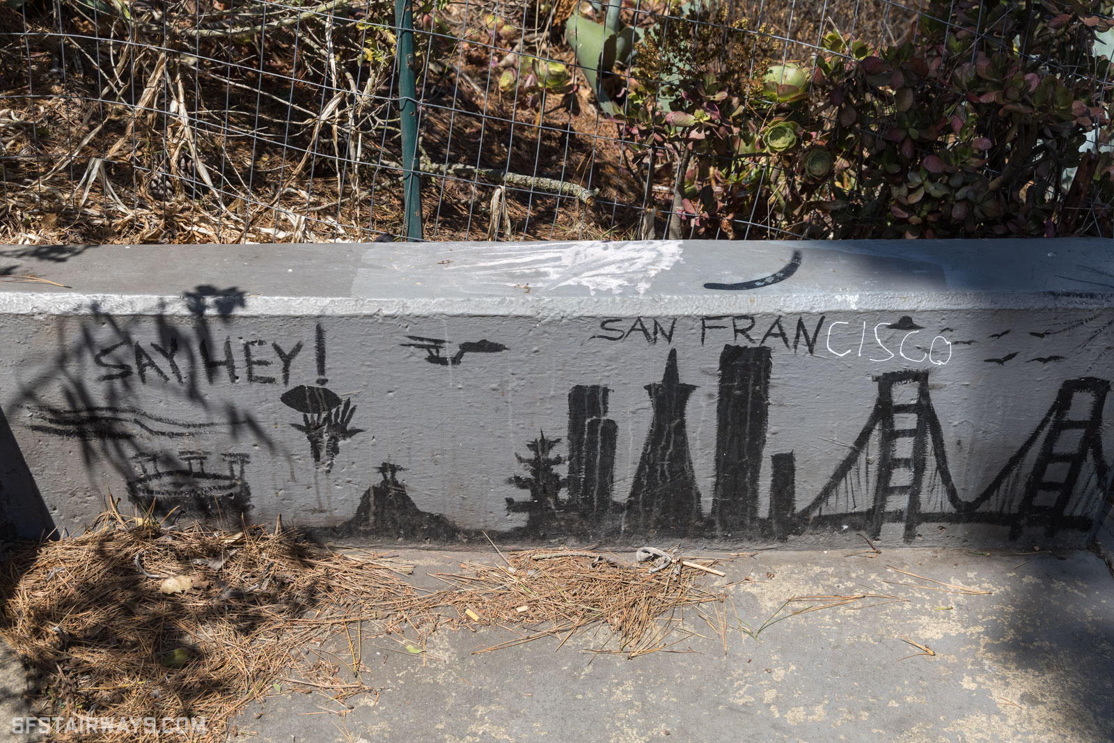
By gghffguhvc 2025-11-240:271 reply When I lived in SF I walked past this street art a couple of times a week and got a smile.
https://www.sfstairways.com/stairways/eugenia-avenue-prospec...
By adastra22 2025-11-243:31 Ha, that’s great!
By clhodapp 2025-11-2321:17 I think it honesty just boils down to: It sounds bad.
You've never met an Alexander that despises being called "Alex"?
By mkoubaa 2025-11-2323:01 No but they all seem upset when I call them Alexa
By gerdesj 2025-11-2323:21 No. Why would you "despise" being referred to?
My first name is Jonathan, I generally get referred to as (int al) Jon, Jonny, Jo, or John (bloody silent letters).
As it turns out, until I was 20 I thought my name was spelt Jonathon. I got a copy of my birth cert to get a student loan and discovered the "truth" - even my passport was wrong and my parents had to sort out the first few of those and they should have known better! I was born in 1970 and no one noticed that I misspelt my own first name for 20 years.
Well, this is THE Bay Area, where we live in THE city, drive on THE 101, and eat in THE Chinatown.... wait...
Funny enough, though, it wasn't until I moved here 15+ years ago that it struck me how odd it is to call it "the Bay Area" and expect people to know what that means. Nonetheless, sportscasters do it. Musicians do it. All other bay areas are just areas around bays...
By ucarion 2025-11-242:09 Eddie Izzard was joking in 1998 about the "The" and the prohibited names for The City (https://youtu.be/QRB_GhLXCds?si=R4kYkodzvYDxe33H&t=276), so it's probably been like this for many decades thence!
By slater 2025-11-242:10 > drive on THE 101
excuuuuuuse you? It's "drive on 101" in NorCal :P
By jes5199 2025-11-2413:30 ride the BART
By stevage 2025-11-247:53 like "the tristate"
By nvader 2025-11-242:12 My theory for why "San Fran" is looked down upon is that the person saying it is perceived as making a claim to status: 'I am so cool and hip that I am on familiar terms with "San Fran".'
But shortening San Francisco to San Fran is both very obvious, and betrays a cheap attempt at sophistication that the soul of SF rejects.
SF feels like a transitory city as multiple successive waves of people drift in and out. That also contribute to why a shibboleth like this gets a lot of airtime. The episode probably recurs weekly in bars all over the city as someone who's just moved here calls it "San Fran", only to be corrected by someone who's been here for just a little longer.
By decimalenough 2025-11-2320:453 reply I'll be sure to call it "Frisco" instead.
+1 on the awesome name though.
By simondotau 2025-11-2321:20 A silent router: Sans Fancisco
By zjp 2025-11-2323:03 That's fine, it's what people from the east and south sides call it.
By RyJones 2025-11-243:40 It’s been a while since I grabbed this: https://blog.ryjones.org/2006/10/21/Welcome-to-the-Bay-Area
By renewiltord 2025-11-2323:153 reply It’s funny how most SF posts will have an “as a native” say that. You don’t really get that from London as much. Strangely parochial attribute of the culture. I wonder which other cities have such populations. NYC has a big “transplant” vs. “native” thing going on so maybe it’s just American, but I think people do it in Vancouver too. Though Canadians just kind of copy Americans for the most part.
I’ve taken to calling the city San Fran as a result. Sometimes I enjoy a good EssEffOh or Frisco too. Really gets the audience going.
By adastra22 2025-11-241:14 NYC is the only other one I can think of, though I’m sure there are many. Maybe LA as well? It’s just that the transplants outnumber the natives by a large amount. The house I live in now was fruit orchards when I was born.
By jeffreygoesto 2025-11-247:211 reply London England or London Ontario?
By andrewshadura 2025-11-2412:31 You mean Real London and Fake London?
